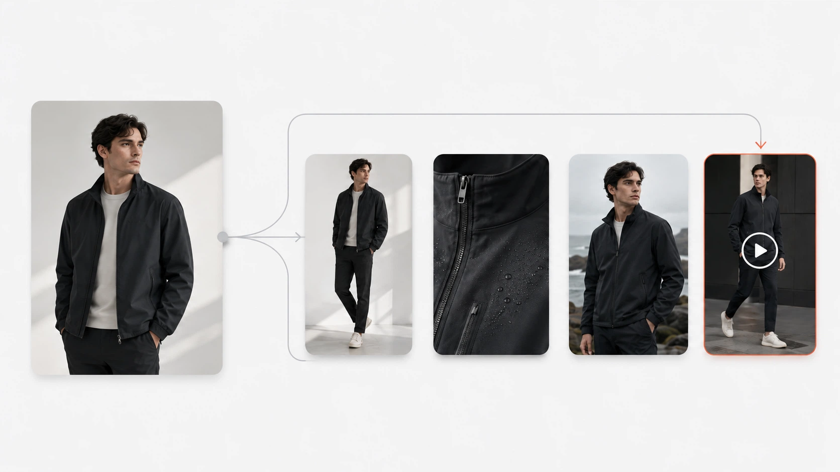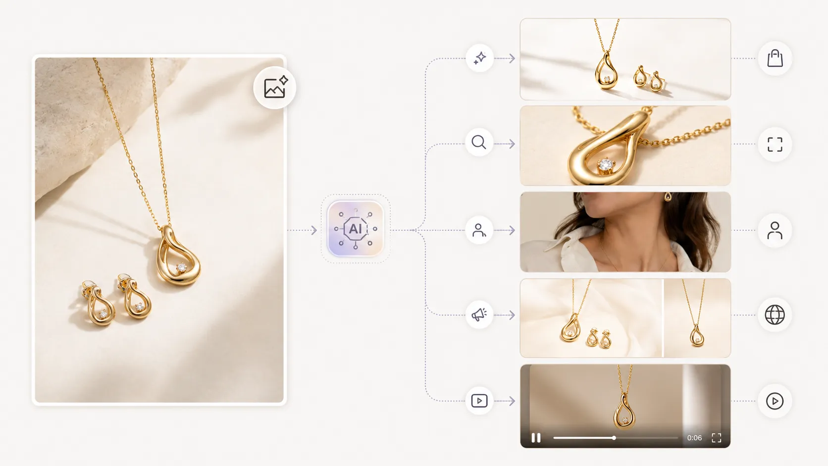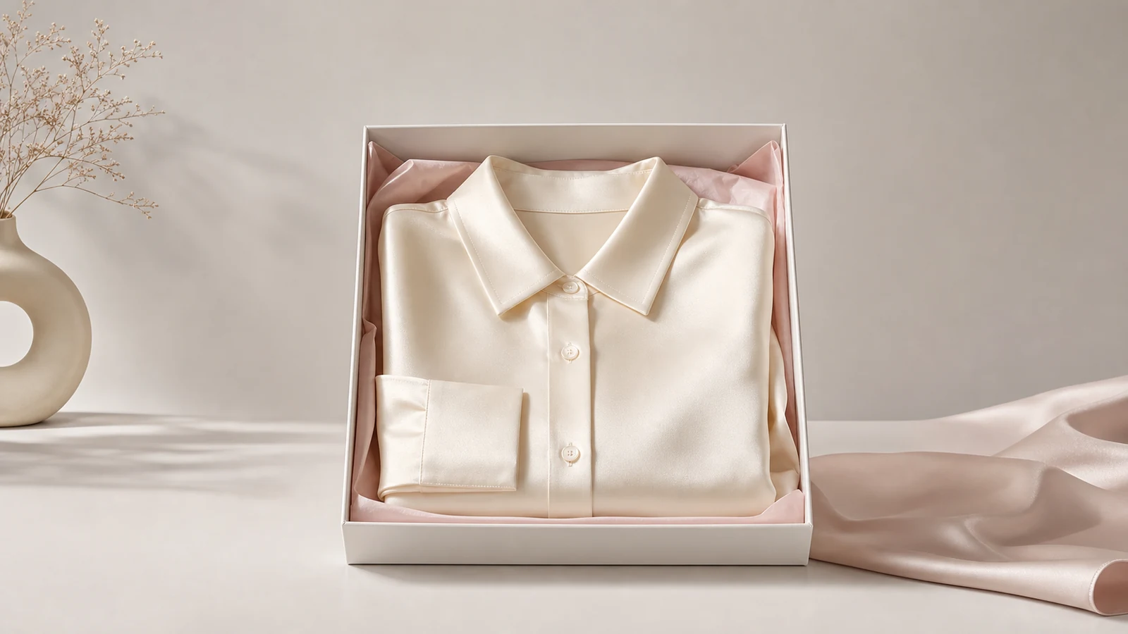




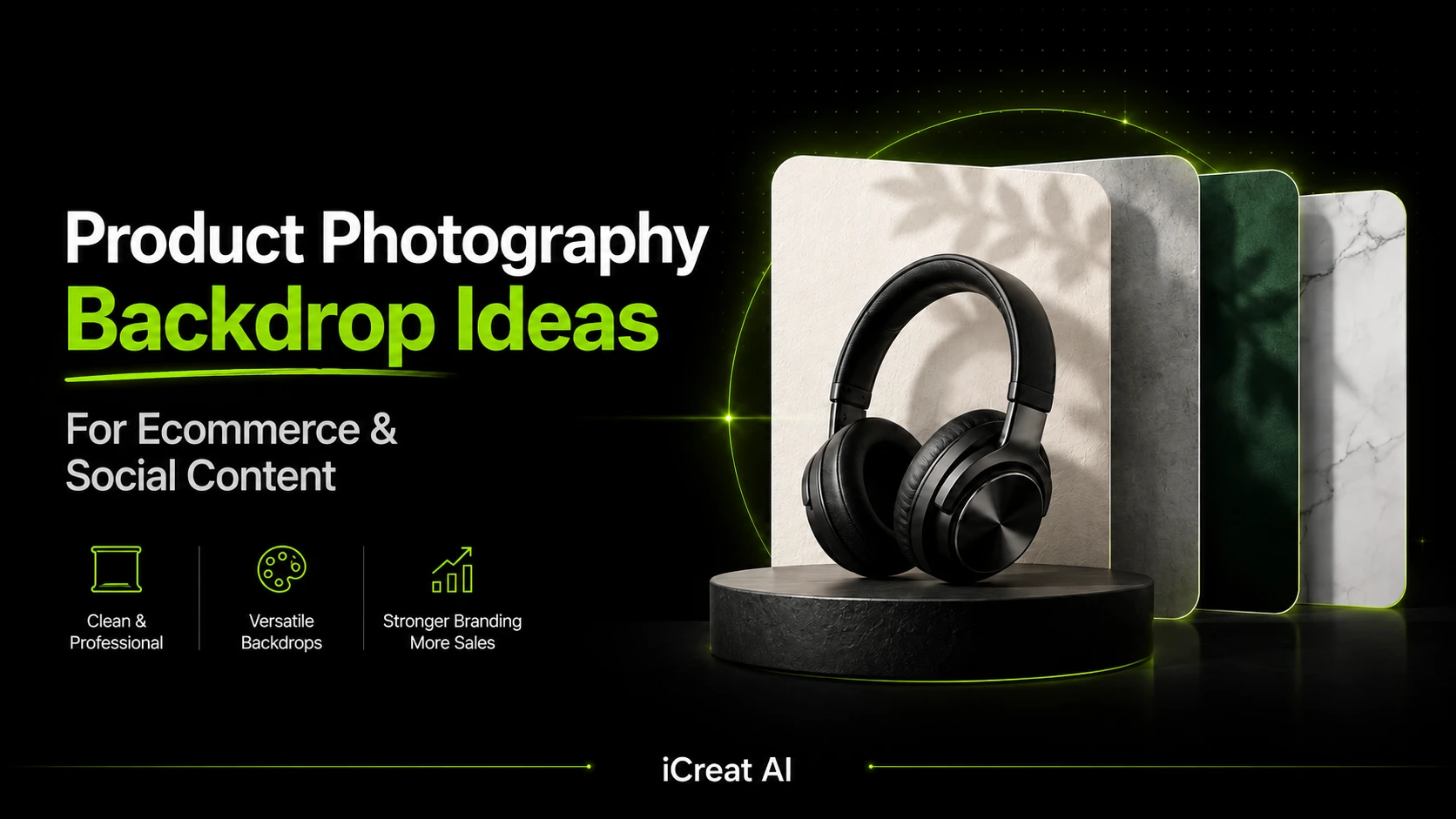
The best product photography backdrop ideas depend on what the image needs to do. White backgrounds work best for clean ecommerce clarity and marketplace requirements, while styled backdrops work better for brand storytelling, seasonal campaigns, and social content. Most brands need both.
That is where backdrop decisions usually go wrong. A background may look attractive on its own but make the product harder to read, weaken trust, or create extra production work every time a campaign changes. This guide explains which backdrop styles work best, when to use them, and how to create more background variations without rebuilding every shoot from scratch.
Key Takeaways
- The right backdrop should make the product easier to understand, not just make the image look more decorative.
- White backgrounds are best for marketplaces, PDP clarity, and clean comparison shopping.
- Neutral, textured, and seasonal backdrops work best when the goal is mood, branding, or campaign storytelling.
- Most ecommerce teams need both clean product backgrounds and styled campaign backgrounds.
- iCreat AI is most useful when you want to test more backdrop directions from the same product reference.
Why Backdrops Matter in Product Photography
Backdrops shape how a product feels before a shopper reads a single word. They influence clarity, perceived quality, color contrast, mood, and how easy it is to understand the item on a small screen.
That matters for ecommerce because product photography is not only visual decoration. It is part of the sales process. If the background competes with the product, the image may still look polished, but it becomes less useful.
According to Baymard Institute research, product imagery is one of the biggest confidence signals in online shopping. A strong backdrop supports that confidence by making the product readable and believable. A weak backdrop adds visual noise and forces the shopper to work harder.
How Backgrounds Affect Clarity, Mood, and Trust
A white background makes comparison easy. A neutral paper backdrop keeps the product central while adding a little warmth. A textured surface can make the scene feel more premium or natural. A seasonal background can turn a standard product image into campaign content.
None of those options is automatically better. The right choice depends on the job the image needs to do.
Why the Wrong Backdrop Can Make a Product Harder to Sell
The wrong backdrop usually fails in one of three ways. It hides important product details, distorts perceived color, or pushes the image too far toward styling and away from clarity.
That problem shows up often in social-first creative work. A team wants a more eye-catching image, chooses a dramatic scene, then realizes the product itself is less visible than before.
If your team needs more visual directions without giving up product clarity, AI Product Photography is the strongest starting point because it keeps the backdrop decision connected to the larger product image workflow.
Best Product Photography Backdrop Ideas
White Backgrounds for Ecommerce and Marketplaces
White backgrounds remain the most practical option when the goal is product clarity, catalog consistency, or marketplace compliance. They work because they remove distractions and make the product easier to compare against other items.
This is the best choice for core product page images, listing assets, and products where shape, color, or finish need to stay accurate.
Neutral Paper Backdrops for Clean Brand Consistency
Neutral paper in beige, gray, soft cream, or muted pastel tones adds more visual warmth than pure white without overwhelming the product. This is a strong middle ground for ecommerce brands that want cleaner visuals with a more branded feel.
Paper backdrops are also practical because they are inexpensive, easy to swap, and consistent across product lines.
Wood and Textured Surfaces for Warmth and Lifestyle Feel
Wood, matte stone, and lightly textured surfaces work well for handmade goods, food, candles, accessories, and home products. They create a more lived-in, tactile feel that can make the product feel more premium or natural.
The main risk is overdoing the texture. If the surface starts pulling attention away from the product, it stops supporting the image.
Fabric Backdrops for Softness and Fashion Context
Fabric backdrops help create softness, movement, and a more editorial mood. They work especially well for jewelry, beauty products, accessories, and fashion details where material feel matters.
For fashion-adjacent products, fabric can also help the scene feel more premium without turning the image into a fully staged lifestyle shoot.
Tile, Stone, or Acrylic for Beauty and Premium Products
Tile, acrylic, or stone-style backdrops are common in skincare, cosmetics, fragrance, and wellness photography because they create a clean premium surface without feeling sterile.
These materials work best when they support the brand tone. A glossy acrylic surface can feel polished and modern, while a matte stone surface can feel more natural and grounded.
Seasonal and Campaign Backdrops for Promotions
Seasonal backgrounds are useful when the image needs to support a specific launch, holiday, or campaign moment. A holiday palette, summer texture, or brand-color scene can help a product feel current without changing the product itself.
This is one of the easiest places to overproduce. If every campaign requires a new shoot, costs rise quickly. That is where AI Image Replacer becomes useful as a variation tool rather than a separate editing task.
How to Choose the Right Backdrop for Your Product Type
The best backdrop is not only about style. It is about product category, use case, and how much context the shopper needs.
Beauty, Skincare, and Cosmetics
Beauty products usually work well with white, acrylic, tile, soft pastel, or stone-like backdrops. These materials support a clean and premium feel while keeping packaging details visible.
If the packaging is already visually complex, choose a simpler backdrop. If the packaging is minimal, a little background texture can help the image feel more branded.
Fashion Accessories and Apparel Details
Accessories often need contrast, softness, and enough space to show material quality. Fabric backdrops, neutral papers, and subtle textured surfaces usually perform better than highly styled scenes.
For product detail assets such as close-ups, white-background visuals, or supporting apparel imagery, AI Fashion Detail Image Generator can support the more detail-driven side of the workflow.
Food, Beverage, and Handmade Products
These products often benefit from warmer surfaces such as wood, linen, matte stone, or light editorial styling. The background can help communicate freshness, handmade quality, or gifting context.
The key is to keep the scene believable. Too much set dressing can make the product feel secondary.
Home Goods and Lifestyle Products
Home goods can support more environmental context because scale, material, and mood all matter. Neutral interior-style backdrops, tabletop surfaces, and natural textures often work well here.
Still, the same rule applies: if the backdrop is more memorable than the product, the image is doing the wrong job.
White Background vs Styled Backgrounds
This is the most useful backdrop decision for most ecommerce teams, because it is rarely an either-or choice.
When to Use White-Background Images
Use white backgrounds when you need listing compliance, clean comparison shopping, strong visual consistency, or a reliable product page image that keeps the item central.
This is usually the safest default for marketplaces and the strongest base asset for broader reuse.
When to Use Styled or Campaign Backgrounds
Use styled backdrops when the image needs more mood, context, or campaign identity. This works best for social posts, launch assets, gift guides, premium merchandising, and seasonal promotions.
Styled backgrounds are not a replacement for clean product images. They are an extension of them.
Why Most Brands Need Both
A useful ecommerce image system usually has at least one clean product visual and one more styled visual direction. One helps the shopper compare. The other helps the brand sell the context.
Shopify's guidance on product images reinforces the importance of clear, high-quality visuals. In practice, that means the clean image does the heavy lifting for clarity, while styled backdrops expand the content for campaigns and social distribution.
Want to build both from the same product reference? Start with AI Product Photography, then expand into more backdrop directions once the core product visual is strong.
How to Create More Backdrop Variations Without Rebuilding the Shoot
Backdrop ideas become expensive when every concept requires a new setup, new props, and new production time. The more efficient approach is to create one strong base product image, then expand from it.
With iCreat AI, that can mean generating product visuals with different background directions from the same source image instead of treating every backdrop idea as a separate shoot.
Testing Multiple Background Directions from One Product Image
One clean product image can often support more than one visual direction. A beauty brand might test a white background, a stone surface, and a pastel campaign scene from the same product reference.
That helps teams compare which direction fits the channel without rebuilding the whole image set each time.
Replacing Backgrounds for Seasonal or Audience-Specific Campaigns
A winter promotion, Mother's Day gift push, or premium retargeting campaign may need a different backdrop even when the product stays the same. That is a creative variation problem, not a new product photography problem.
When the image concept is already working, AI Image Replacer can help adapt the background direction while preserving the core product presentation.
Preparing Transparent Cutouts for Flexible Workflows
Sometimes the most efficient backdrop workflow starts with no backdrop at all. A clean cutout or transparent-background image gives the team a flexible base for new campaign scenes, product pages, and promotional layouts.
Background Remover is the most useful supporting tool here when you need a transparent cutout before testing new backdrop concepts.
Common Backdrop Mistakes to Avoid
Busy Textures That Overpower the Product
If the product blends into the surface or loses edge definition, the backdrop is doing too much. This is a common problem with aggressive textures, props, and heavy seasonal styling.
Colors That Distort the Product Look
Strong background colors can shift how the product appears on screen, especially for beauty packaging, apparel, and reflective materials. If color accuracy matters, keep the backdrop neutral or controlled.
Weak Lighting and Dirty Shadows
Even a good backdrop looks poor under weak lighting. Uneven shadows, color casts, and low contrast make the product feel less polished and harder to trust.
Using One Backdrop for Every Use Case
One backdrop rarely serves every purpose. A white-background product page image, a soft lifestyle image, and a seasonal social asset are all trying to do different jobs.
The most practical workflow is not choosing one perfect background. It is building a small set of backdrop directions that match your real content needs.
A Practical Workflow
- Start with the cleanest possible product reference.
- Decide whether the first asset is for a marketplace, a PDP, social content, or a campaign.
- Build one clean backdrop version first.
- Add one or two styled backdrop directions that serve a clear use case.
- Review the outputs for product clarity, color accuracy, and visual hierarchy.
- Reuse the strongest version across more placements or campaigns.
That workflow gives you more options without turning every visual update into a full reshoot.
FAQ
Conclusion
Product photography backdrop ideas are only useful when they help the product sell more clearly. The strongest backgrounds support the image goal, whether that is clean comparison shopping, premium branding, or seasonal campaign content.
If your team needs more backdrop variation without repeating the entire shoot, start with iCreat AI's AI Product Photography. To adapt strong concepts for new campaign scenes, use AI Image Replacer. For flexible cutout-based workflows, Background Remover helps prepare transparent product assets that can support more backdrop directions later.
When you are ready to test your next product image setup, log in to iCreat AI and start from your strongest product reference.