



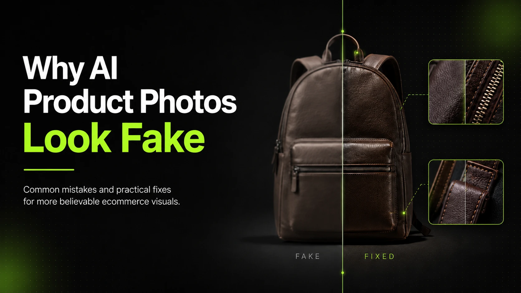
AI product photos usually look fake because of weak reference images, broken lighting logic, detail drift, or poor review discipline. In most cases, the issue is not that AI can never create believable product visuals. The issue is that the workflow did not protect the product well enough.
That matters because shoppers are not grading AI creativity. They are deciding whether the product looks trustworthy enough to click, compare, or buy. A product image can look stylish and still fail the commercial test.
Key Takeaways
- Fake-looking AI product photos usually fail on shadows, edges, texture, logos, or proportions.
- The most common cause is weak workflow setup, not just a bad model.
- Better references, cleaner prompts, and stronger review habits improve realism faster than adding more styling.
- Higher-detail workflows are useful when product accuracy matters more than speed.
- iCreat AI is most useful when you want to turn strong reference images into more believable ecommerce visuals.
What Makes an AI Product Photo Feel Fake
Most fake AI product images break trust in familiar ways. The object does not sit naturally in the scene. The shadow direction feels wrong. The texture looks smeared. The product details drift just enough to feel off.
These issues are especially damaging in ecommerce because shoppers use product images to judge finish, shape, material, and quality. If the image feels synthetic, the product can feel less credible too.
Broken Shadows and Lighting Direction
Lighting is one of the fastest ways to spot a fake-looking product image. If the object is lit from one angle but the shadow falls in another, the scene stops feeling believable.
This is not only a photography problem. It is a shopper-trust problem. Lighting tells people whether a product has real depth, texture, and surface logic.
Inconsistent Edges, Proportions, and Surfaces
Soft cutout edges, distorted corners, uneven packaging lines, or warped silhouettes all make a product image feel synthetic. Some images fail because the object itself no longer feels physically plausible.
That is why product realism should be reviewed structurally before anyone worries about style.
Lost Logos, Texture, and Packaging Details
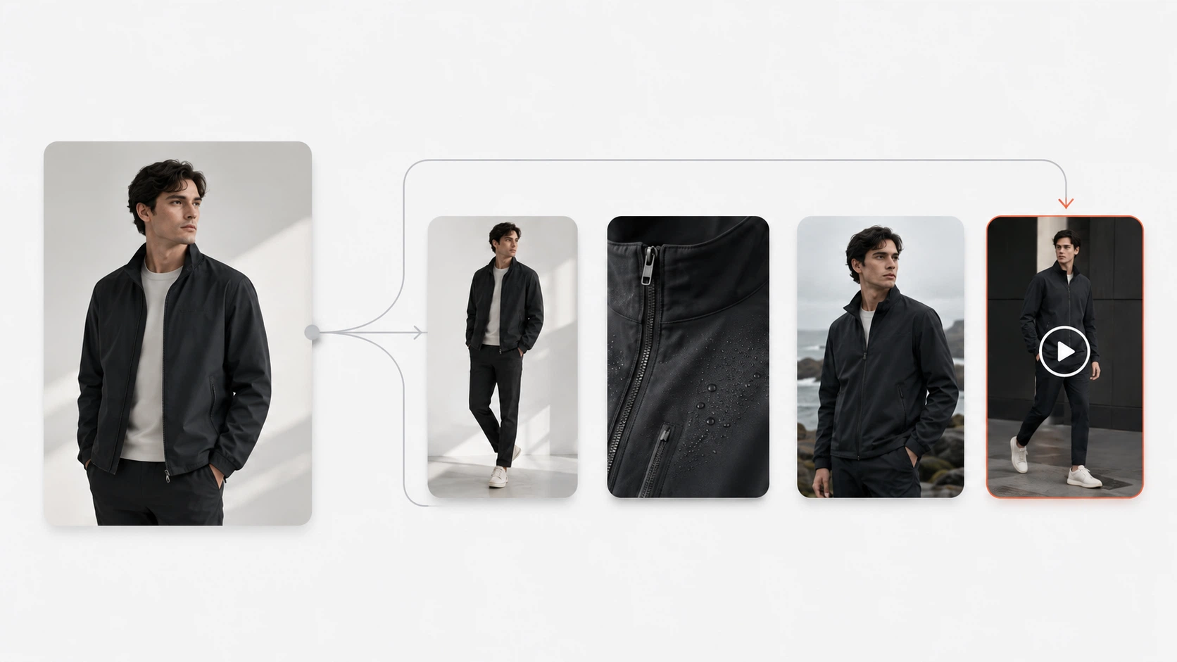
Many AI outputs fail on the exact details ecommerce teams care about most. A logo softens. A zipper becomes vague. Fabric texture turns into a generic pattern. Label text drifts. The packaging shape stays close enough to be tempting, but not accurate enough to publish.
If the product detail is part of the value, this kind of drift is a real problem.
Common Mistake 1: Weak Reference Images
The most common realism mistake happens before generation starts.
Why Poor Source Images Create Poor Outputs
If the reference image is blurry, poorly lit, low contrast, or missing important visual information, the output has less useful structure to work from. The model is forced to invent more, and invented details are often where realism breaks.
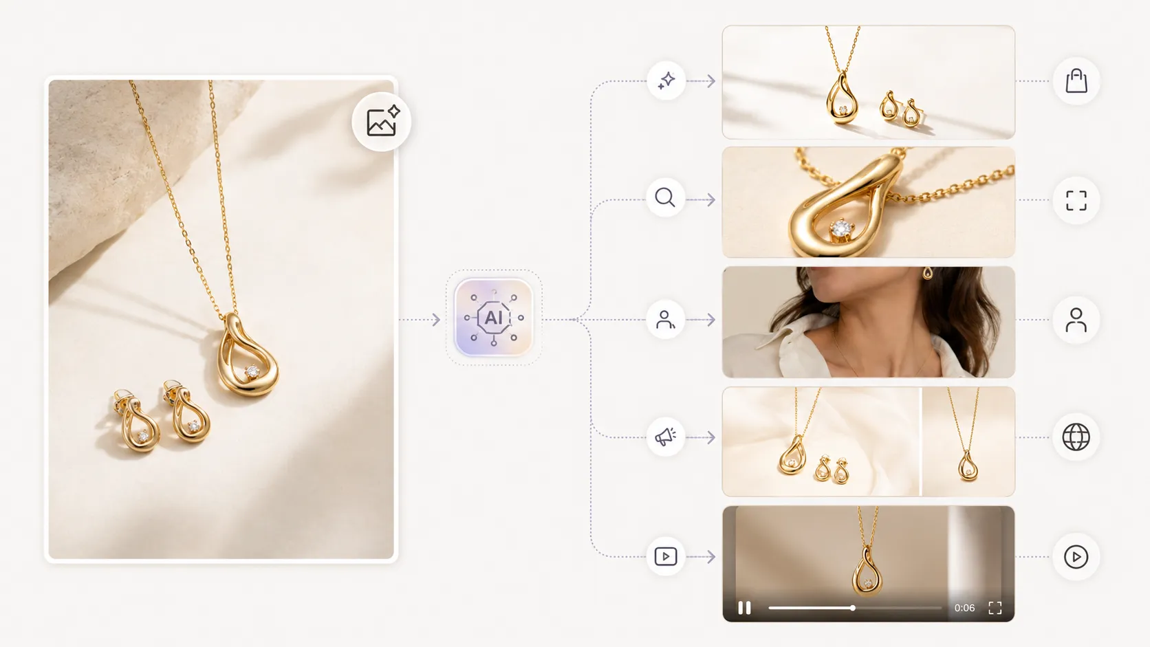
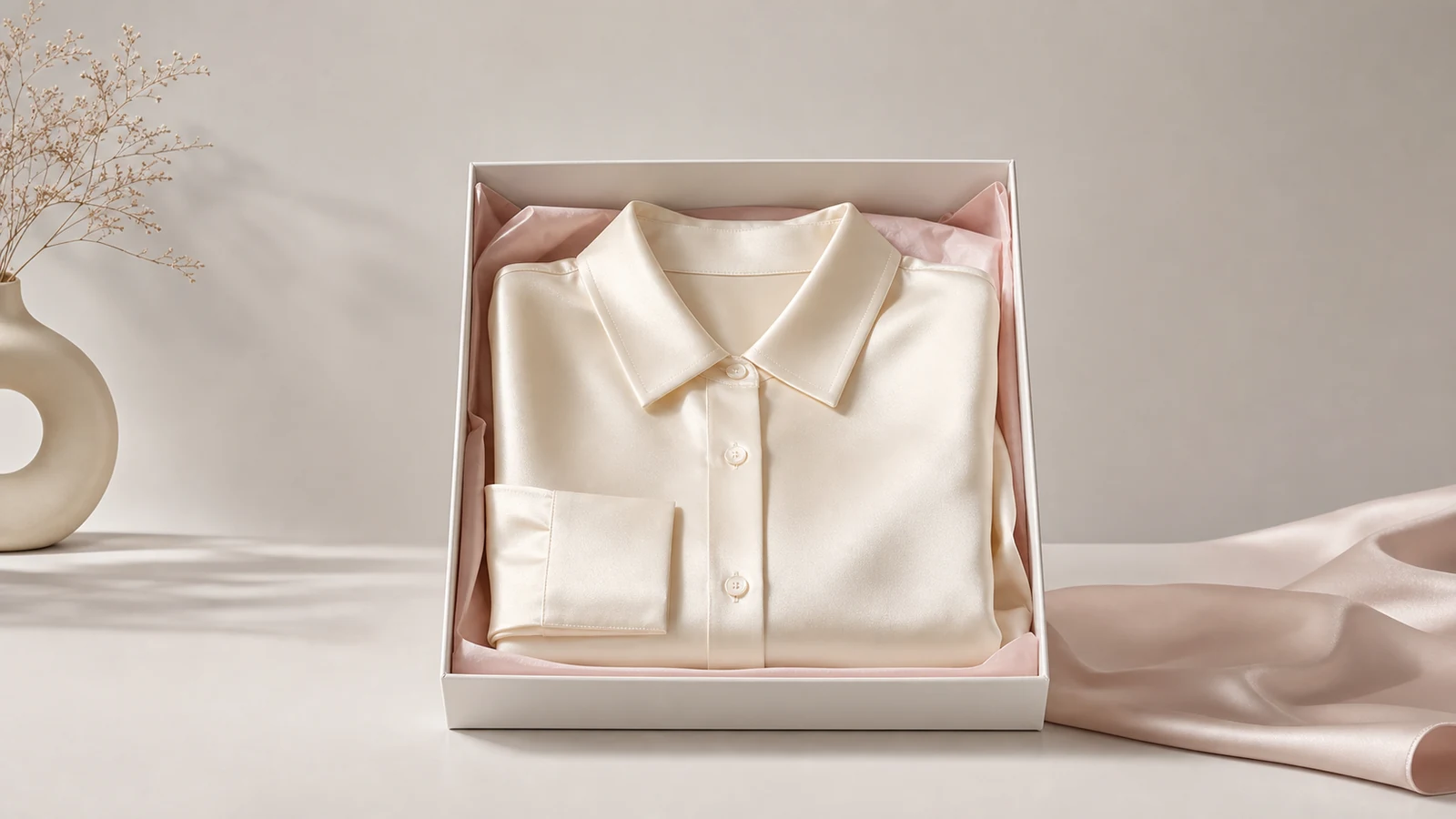
This is especially true for reflective packaging, textured fabrics, jewelry, and branded products with small visual details.
How To Choose Stronger References
Start with the cleanest reference image available. Make sure the product shape, color, surface, and major details are easy to see. If the product has important small elements, add a second or third detail image rather than hoping the model will guess correctly.
For fashion ecommerce, this often means including detail views for seams, collars, prints, logos, or back-view structure.
If you want to create more ecommerce visuals from strong references, AI Product Photography is the right workflow to start with because it is built around reference-image-driven generation.
Common Mistake 2: Prompts That Prioritize Style Over Product Accuracy
Many teams accidentally prompt for mood instead of product truth.
Why Overstyled Prompts Hurt Realism
An overstyled prompt can create a beautiful scene while weakening the product. The background becomes too dramatic. The lighting becomes too cinematic. The composition becomes more about the scene than the item being sold.
That might work for inspiration content. It usually does not work for ecommerce product trust.
How To Write Product-First Prompts
A stronger prompt describes the product outcome clearly. It protects product shape, material response, lighting direction, and what details must stay accurate.
This is where a supporting tool like Image to Prompt can help. It gives teams a more structured way to analyze what is working in a reference image so the prompt logic stays grounded in real visual cues.
Common Mistake 3: Using the Wrong Model or Workflow
Not every product image needs the same generation approach.
When Standard Generation Is Enough
For simpler products and lower-risk scenes, a standard generation workflow may be enough. If the image is clean, the background is simple, and the product does not depend on micro-detail accuracy, speed may matter more than advanced detail restoration.
When Higher-Detail Workflows Matter More
When realism depends on fabric behavior, logo sharpness, edge quality, texture fidelity, or more believable lighting, the workflow needs stronger output quality.
Nano Banana Pro is better positioned for these higher-detail commercial outputs. It is especially relevant when the image needs a more polished, more believable finish rather than only a fast concept.
The right choice depends on the product, not just the model name.
Common Mistake 4: Skipping Review Like a Commercial Team
An image can look attractive and still be wrong.
How To Review Shadows, Edges, and Textures
Start with the structural review. Check whether the product sits naturally in the scene, whether the shadow direction makes sense, and whether the edges feel too soft or too cut out.
Then review material and detail quality. Look at texture continuity, label placement, hardware shape, print sharpness, packaging geometry, and branding clarity.
When To Reject an Output and Regenerate
Not every weak image should be fixed in post. Some outputs should simply be rejected. If the proportions are wrong, the detail drift is too visible, or the product no longer feels trustworthy, it is usually faster to regenerate than to force a weak image into production.
Suitable workflows and input conditions may reach around 80% visual similarity in some cases, but that should never be treated as guaranteed. Human review still matters because the last 20% is often where shopper trust is won or lost.
Practical Fixes That Improve Realism Fast
Add Detail Images
If the product has important visual complexity, add a detail image before generating again. This is one of the fastest ways to improve output quality without rewriting the entire workflow.
Use Image-To-Prompt For Better Visual Logic
When the prompt is too vague or too aesthetic-driven, use a more structured prompt-building process. Image-to-prompt workflows can help identify lighting direction, composition, background simplicity, and visual hierarchy more clearly.
Upscale and Refine Only After the Core Image Works
If the image is already believable but needs a cleaner finish, Image Upscaler can help improve resolution and final presentation quality. It works best as a refinement step, not as a rescue tool for a weak image.
Want a faster path to stronger product visuals? Start with AI Product Photography, use cleaner references, generate several versions, and review them like an ecommerce team before choosing a final asset.
A Practical Diagnostic Workflow
- Start with the cleanest product reference image available.
- Add detail images when texture, branding, or structure matters.
- Write a prompt that protects product logic before style.
- Choose the workflow based on the detail requirement.
- Compare multiple outputs before picking one.
- Review shadows, edges, textures, and small details before publishing.
This approach is more useful than trying to "hack realism" with one prompt tweak. Fake-looking AI product photos are usually the result of a weak commercial workflow, not a single missing trick.
For a Shopify operator, that may mean improving one PDP image until it feels trustworthy. For a fashion team, it may mean building a larger set of believable campaign visuals while protecting garment detail and visual consistency.
FAQ
Conclusion
AI product photos look fake when the workflow allows too much invention and too little control. The strongest fixes are not magical. They are practical: cleaner references, better prompt logic, more suitable model choice, and stricter review.
If you want to create more believable ecommerce visuals from your own product references, start with iCreat AI's AI Product Photography. If the project needs stronger detail restoration and more polished lighting, Nano Banana Pro is a stronger fit for that workflow. For prompt refinement and final quality support, Image to Prompt and Image Upscaler can strengthen the process.
When you are ready to improve product photo quality without rebuilding every visual manually, log in to iCreat AI and start from your strongest reference image.