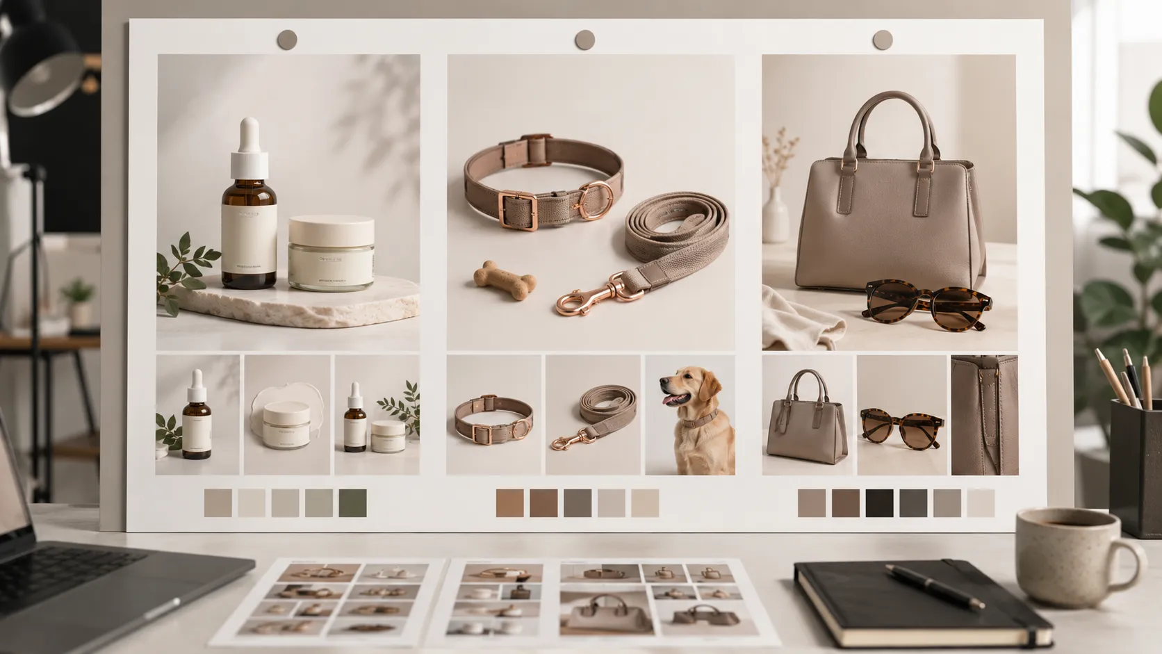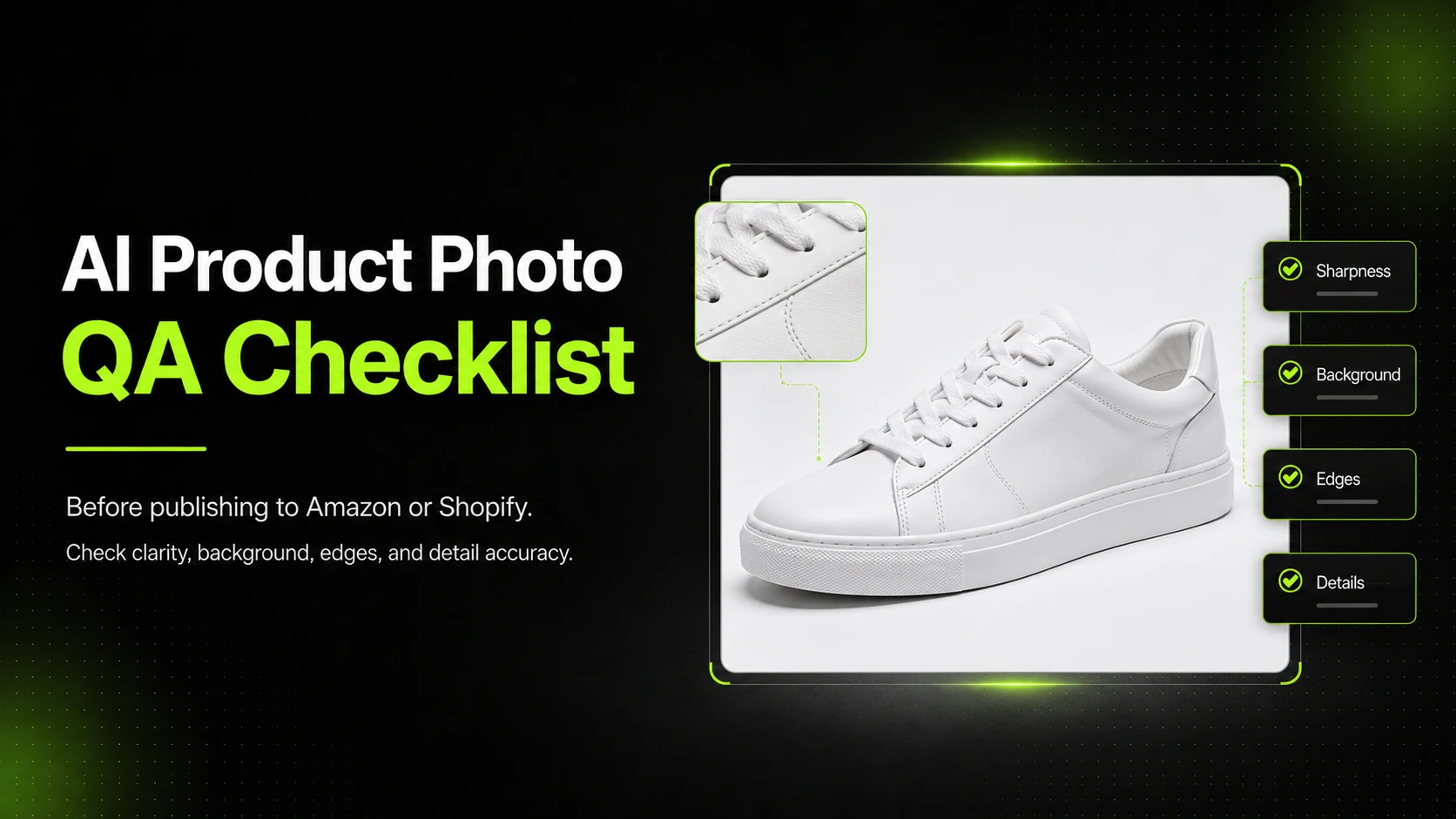




Most agencies that adopted AI for ideation can now produce thirty moodboard tiles in the time it used to take to source three. The problem is no longer speed. The problem is that clients cannot tell what they are looking at.
An AI moodboard presentation for agency clients is the practice of showing those tiles in a way the client can actually read. Without it, the agency either over-explains every tile or watches the client fall in love with a two-minute sketch that has invented packaging text and a logo that does not exist. This guide walks through a three-layer framework agencies can use to sort tiles before the client sees them, the labeling rules that keep clients from misreading them, and the mistakes that tend to surface two weeks later — usually as a final deliverable that missed the brief.
Why AI Moodboards Confuse Ecommerce Clients (More Than They Help)
AI moodboards confuse ecommerce clients because the tiles look finished. A hand-curated moodboard made of tears from magazines has a built-in signal — the client can see that the images come from somewhere else, that they are references, not commitments. An AI-generated moodboard does not have that signal. The tiles are uniform in finish, sharpness, and framing. They look like deliverables.
This is the central confusion. The agency generated the tiles fast, cheap, and as exploration. The client receives them as creative. The agency is in concept mode; the client reads them as final.
The failure modes that follow are predictable.
- The client rejects a good direction because one tile looks off. A dress campaign moodboard contains twelve concept direction tiles and one slightly awkward product exploration tile. The client fixates on the awkward one and kills the whole direction.
- The client falls in love with a detail that does not exist. A skincare bottle moodboard contains a tile where the AI invented a label text that does not match the client's actual product. The client asks to "keep that wording." The agency has to explain that the wording was not real.
- The client asks to ship a tile as final. A moodboard tile gets forwarded to the client's ecommerce team. Three weeks later, it is on the product page, un-reviewed, with the AI's invented logo in place of the real one.
The cost of the first failure is a lost direction. The cost of the second is an awkward client conversation. The cost of the third is shopper trust.
Research on how generative AI is changing design processes — including an arXiv paper on the transformation of design processes due to generative AI — notes that AI disrupts the ideation phase precisely because it lets clients engage with rapid visualizations earlier than they used to. That early engagement is the opportunity. The confusion is the cost. The rest of this guide is about capturing the first without paying the second.
What an AI Moodboard Is (and Is Not) in Agency Work
An AI moodboard in agency work is a visual artifact used to align the agency and the client on creative direction before final production begins. It contains tiles — individual images — that each carry one specific kind of reference.
It is not a creative deck. It is not a final asset. It is not a brief in visual form.
The distinction matters because agencies have started treating AI moodboards the way they used to treat finished creative decks — presenting them in the same format, in the same meeting slot, with the same verbal weight. That conflation is the source of most client confusion.
Three properties distinguish a moodboard from a final creative deck.
- Purpose. A moodboard exists to align direction. A final creative deck exists to ship.
- Source. A moodboard contains references — to worlds, styles, moods, and product variations. A final deck contains the agency's commitment to a specific execution.
- Finish. A moodboard tile is intentionally unresolved. A final asset is intentionally complete.
Adobe's overview of AI mood board use cases describes the tool category as supporting design, marketing, and brand campaign ideation — which is the correct scope. The mistake agencies make is treating moodboards as a presentation of finished creative rather than as an alignment artifact.
The rest of this guide treats the moodboard as what it is: an internal alignment tool that the client happens to see. Everything that follows is about making that visibility safe.
The Three Layers Every Agency Moodboard Presentation Needs
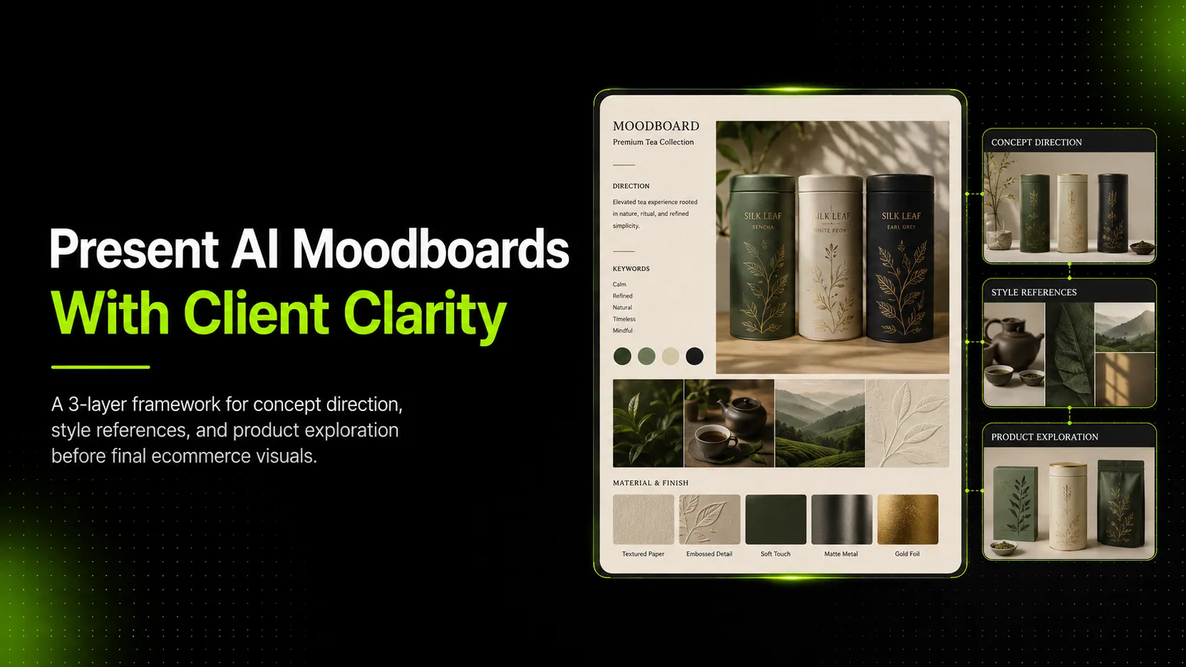
A workable AI moodboard presentation splits every tile into one of three layers. Each layer has one job, one source, and one set of rules. Mixing the layers in a single grid is what produces client confusion — separating them is what makes the presentation useful.
Layer 1 — Concept Direction Tiles
Concept direction tiles show the world the campaign could live in: a location, a lighting setup, a model styling direction, a mood. They are not about the product specifically — they are about the atmosphere the product would sit inside.
For a dress campaign, concept direction tiles might be a sun-bleached rooftop, a marble gallery, a street market at dusk. For a sneaker campaign, they might be a skate park at dawn, a Tokyo crossing at night, a desert highway.
The job of this layer is to align on tone before anyone spends time on the product. Concept tiles are cheap to make and easy to throw away — that is the point.
Layer 2 — Style Reference Tiles
Style reference tiles show how similar campaigns have looked visually. They are about composition, color treatment, post style, and photography language drawn from existing editorial or campaign work — not from the client's own product.
For a handbag campaign, style references might be editorial photography showing how a luxury accessory is typically framed, lit, and styled. For a skincare campaign, they might be minimal studio compositions with soft shadows and a single prop.
This layer is where the agency shows what "good" looks like in the category. The client is not choosing a handbag or a bottle; they are choosing a visual treatment.
Layer 3 — Product Exploration Tiles
Product exploration tiles are the riskiest layer. They show variations of the client's actual product — different angles, backgrounds, props, and lighting setups — generated by AI.
For a skincare bottle, product exploration tiles might show the bottle on a stone surface, in soft window light, with a sprig of botanical, or against a colored backdrop. For a t-shirt, they might show different model poses, fabric drapes, or color treatments.
This layer is risky because the AI invents details. A skincare bottle's label text gets fabricated. A t-shirt's print gets approximated. A handbag's logo gets reshaped. The client looks at the tile, sees a polished result, and assumes the details are real.
The fix is not to skip this layer — product exploration is where the agency earns its fee. The fix is to label these tiles clearly, run them through a quality-control scrub before the client sees them, and verbally frame them as drafts in the meeting. If the agency needs to generate product-exploration tiles from the client's real reference image rather than from a generic stand-in, iCreat AI's AI Fashion Lookbook Generator is built for that exact step — it turns one product image into an editorial-style variation set that stays anchored to the actual product.
A useful decision test for assigning a tile to a layer:
| Question | If yes | Layer |
|---|---|---|
| Does the tile show a world, mood, or atmosphere without the client's product? | Yes | Concept direction |
| Does the tile show how similar campaigns look, drawn from external editorial or campaign work? | Yes | Style reference |
| Does the tile show the client's actual product, in a variation the agency is exploring? | Yes | Product exploration |
| Is the tile ambiguous between two of the above? | Yes | Re-make it with a clearer job, or label it explicitly |
The rule of thumb: every tile should be assignable to exactly one layer in under five seconds. If it cannot, the tile is doing too much.
How to Label and Sequence Tiles So Clients Read Them Correctly
The three-layer framework fails in practice if the client cannot tell which layer they are looking at. Labeling and sequencing are how the agency makes the framework visible to the client.
Label Every Tile
Each tile should carry a visible label that names its layer and its draft status. A short text strip along the bottom of the tile — `Concept direction · draft`, `Style reference · external`, `Product exploration · draft · not final` — is enough. The text is small but legible. It tells the client how to read the tile before they form an opinion.
The label has two jobs. First, it forces the agency to commit to the layer before showing the tile — a tile that cannot be labeled is a tile that should not be in the deck. Second, it gives the client a vocabulary. When the client says "I love this one," the agency can ask "as a concept direction, or as a product exploration?" and the conversation gets more precise.
Sequence by Layer
The presentation should move through the layers in order — concept direction first, then style references, then product exploration. This sequence mirrors how the agency actually makes decisions: world first, then visual language, then product treatment.
If the agency presents product exploration tiles before concept direction tiles, the client fixates on the product — because it is the most concrete thing in front of them — and skips the directional conversation the agency needed to have.
Verbally Frame the Riskiest Layer
Product exploration tiles need verbal framing in the meeting, not just labels. The presenter should say, out loud, something like: "These next tiles are draft explorations of your product in different settings. The details are not final — the AI approximates labels, prints, and logos. We are looking at angle, background, and mood, not at accuracy."
That single sentence prevents the most expensive client-misreading failure: falling in love with an invented detail.
Separate Real Product From Stand-In
Some product exploration tiles use the client's real product as the input. Others use a stand-in — a generic bottle, a stock t-shirt — when the real product is not yet available. These two cases need different labels: `Your product · draft` versus `Stand-in · draft`. The client's reading of accuracy depends on which one they think they are looking at.
A useful rule of thumb: if the client has to ask "is that our product?" the tile has already failed at its job.
Common Mistakes When Presenting AI Moodboards to Clients
AI moodboard presentation fails in predictable ways. Recognizing them early is cheaper than rebuilding the practice after a client mishap.
Mistake 1: No layer labels. The agency presents a uniform grid of tiles. The client reads them as a uniform grid of creative. *Fix*: label every tile with its layer and draft status before the meeting.
Mistake 2: Mixing real product with stand-in, unlabeled. Some tiles use the client's real product; others use a generic stand-in. The client cannot tell which is which. *Fix*: `Your product · draft` versus `Stand-in · draft` — visible on every tile.
Mistake 3: Presenting product exploration before concept direction. The client fixates on the most concrete thing in front of them and the directional conversation never happens. *Fix*: sequence layers in order — concept, style, then product.
Mistake 4: No verbal framing on the riskiest layer. The presenter assumes the labels speak for themselves. The client does not read labels in real time. *Fix*: verbally frame product exploration tiles in the meeting, naming the specific risks (invented label text, approximated prints, reshaped logos).
Mistake 5: Tiles leak from moodboard to final without re-generation. A client loves a product exploration tile and asks to ship it. The agency forwards it. *Fix*: when a tile is chosen for final production, it leaves the moodboard tier. The agency regenerates with full inputs (reference, detail, back view), the advanced model, and a review gate — exactly as it would for any other final asset.
Mistake 6: Showing other creators' work without clearance. Style reference tiles pulled from competitor campaigns, editorial photography, or social content can create IP problems if the client assumes they are fair use. *Fix*: treat style references as in-meeting references only — do not embed them in deliverables, and call out that they are external sources.
Practitioner discussion in communities like r/graphic_design on presenting moodboards to clients repeatedly raises this last concern. The risk is real, and it is the agency's responsibility, not the client's.
A Starter Checklist for Agency Moodboard Presentations
A short checklist. Pre-presentation is the gate the agency owns. In-meeting is the discipline the presenter owns.
Pre-presentation (before the client sees the deck):
- [ ] Every tile assigned to exactly one layer (concept / style / product exploration)
- [ ] Every tile labeled with its layer and draft status
- [ ] Product-exploration tiles labeled `Your product · draft` or `Stand-in · draft`
- [ ] Invented brand marks, packaging text, or logos scrubbed from product-exploration tiles where possible
- [ ] Unauthorized human likeness removed (especially if face-swap tools were used)
- [ ] Third-party IP cleared or replaced for any style reference that will be embedded in a deliverable
- [ ] Tiles sequenced by layer: concept → style → product
- [ ] Verbal framing prepared for the product exploration section
In-meeting (while presenting):
- [ ] Presenter names the three layers up front, before showing any tile
- [ ] Presenter transitions explicitly between layers ("Now moving from concept direction into style references")
- [ ] Product exploration section opens with the verbal framing
- [ ] Client questions routed back to the layer the tile lives in ("That tile is concept direction — are we aligned on the world, or do you want to push the product exploration in a different direction?")
- [ ] Any tile the client wants to ship gets flagged for re-generation through the final-asset workflow, not forwarded as-is
The two-section split is deliberate. Pre-presentation discipline is what makes the meeting safe. In-meeting discipline is what makes the meeting useful.
FAQ: AI Moodboards for Agency Client Work
Does every agency client need a moodboard presentation? Most do, once the agency uses AI for ideation. The exception is retainer clients where direction has been stable for years and the agency is producing variations within an agreed visual language. Project clients and new-brand clients almost always benefit.
Should the moodboard be AI-generated, hand-curated, or both? In practice, mixed. Concept direction tiles are often AI-generated because they are about atmosphere, not product accuracy. Style references are usually hand-curated from external editorial work. Product exploration tiles are AI-generated because the agency needs variations of the client's product. The mix matters less than the layering.
How many tiles per layer? Concept direction: six to twelve tiles. Style references: four to eight. Product exploration: six to twelve. Going above these counts tends to overwhelm the client; going below tends to feel thin.
Do we need a separate tool for moodboards versus final production? Usually no. Most modern AI image platforms support both ideation and final production in the same workflow — the discipline is operational, not tooling. The exception is when the agency specifically wants a different visual language for ideation versus production, in which case a dedicated moodboard tool can make sense.
How do we handle a client who wants to skip the moodboard step and go straight to final? Push back. Skipping the moodboard step almost always costs more time downstream, because the agency produces final creative against a direction the client has not actually agreed to. Frame the moodboard as a one-hour investment that prevents a two-week re-do.
What about retainer clients who already know the visual language? For retainers, the moodboard step shrinks but does not disappear. Concept direction may be a single tile or skipped. Style references may be a refresh rather than a rebuild. Product exploration remains mandatory because every new SKU needs angle, background, and prop decisions.
Who curates the moodboard before the client sees it? The creative director. AI can generate thirty tiles in an hour — the practical guide to using AI in a creative agency from tryapprove.com makes the underlying point bluntly: the creative director still has to pick the right ones. Curation is the value the agency sells; generation is the commodity.
When You Want One Tool for Moodboards and Final Production
The moodboard is one tier in a larger workflow. Treating it as separate from final production is what creates the leak risk — tiles escape the moodboard, skip the review gate, and end up on the client's product page.
The cleaner pattern is to keep both moodboard exploration and final production inside one workflow, with different rules per stage. Generate product-exploration tiles from the client's real reference image, label them as drafts, run them through the moodboard meeting, and — when a tile is chosen — regenerate through the final-asset workflow with full inputs, the advanced model, and the review gate.
When a tile is ready to move from exploration to final production, iCreat AI's AI Product Photography workflow supports the same reference-image pipeline with the advanced model and the review discipline a final asset requires.
The moodboard is where the agency earns the client's trust on direction. The final asset is where the agency earns it on accuracy. One workflow, two rule sets.