



Key Takeaways
- White remains the most reliable background for many listing and marketplace contexts because it keeps the product clear and distraction-free.
- Soft neutral backgrounds work well when a brand wants a cleaner styled look without overpowering the product.
- Dark or colored editorial backgrounds can work for luxury, fashion, and campaign images, but they are riskier for strict listing use.
- Lifestyle backgrounds are strongest when the goal is context, not strict product inspection.
- Background choice should match the channel, the product type, and the level of visual trust the image needs to create.
- Before publishing, check that the background keeps the product easy to inspect, does not distort color, and still fits the channel where the image will appear.
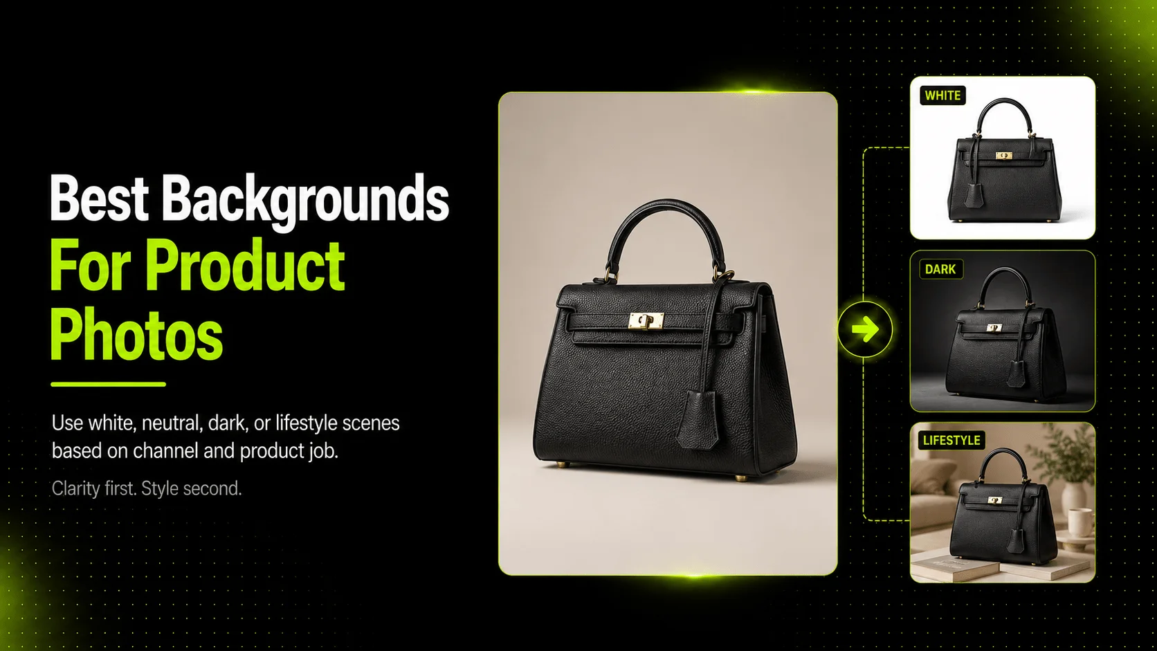
The most common background colors for ecommerce product photography are white, light neutral tones, dark editorial tones, and real-world lifestyle backgrounds. The right choice depends on where the image will be published, what type of product you sell, and whether the image is meant to help a shopper inspect the product or imagine it in context.
That distinction matters because not every product image has the same job. A listing image often needs clarity and low distraction. A product page may need a mix of clean detail shots and supporting context. An ad or social post can tolerate more atmosphere, as long as the background still keeps the product clear.
Why background color matters in ecommerce product photography
Background color shapes how a shopper reads the product. It affects contrast, clarity, perceived quality, and whether the product feels easy to inspect.
For a skincare bottle, a clean white or pale neutral background can make label details, cap shape, and color differences easier to see. For a handbag, a darker editorial background may make the silhouette feel more premium, but it can also make hardware details harder to inspect if lighting is not controlled. For a sneaker, the right background can either make the product shape look sharp or cause the edges to blend into the scene.
In ecommerce, that is not just a design preference. It is part of how the product communicates trust. If the background distracts from the item, changes its apparent color, or makes the product harder to read, the image becomes less useful even if it looks stylish.
That is why background color should be chosen by image purpose, not just taste.
The most common background colors and when to use them
| Background color or style | Best use | Strengths | Risks |
|---|---|---|---|
| White | listings, marketplaces, clean PDP main images | clear, distraction-free, familiar for commerce | can feel flat if every image uses it |
| Light neutral | branded product pages, soft lifestyle detail shots | polished without overwhelming the product | poor contrast for very pale items |
| Dark neutral or black | premium campaign visuals, fashion/editorial images | dramatic contrast, luxury feel | riskier for listings and fine detail visibility |
| Colored background | seasonal campaigns, social ads, brand storytelling | strong mood, visual differentiation | can distort perceived product color |
| Lifestyle scene | product pages, social, ads, educational context | helps shoppers imagine real use | less useful for strict inspection and some listing contexts |
White is still the safest default when the job is straightforward product visibility. Shopify's ecommerce photography guidance also points to white background imagery as a common commerce style because it gives shoppers a clean, distraction-free view of the item. Adobe's product photography guide makes a similar point: clean product-only images are often used for ecommerce listings because they keep the product central.
That does not mean white is always best. It means white is often the lowest-risk starting point.
Which background colors work best for listings, product pages, and ads
Listings and marketplace-style images
For listings, clean backgrounds are usually safest. Google Merchant Center's image guidance stresses that the image should accurately display the entire product and should not contain promotional overlays or distracting elements. That makes white and very light neutral backgrounds the safest options when the goal is a listing-safe image.
If you are photographing a skincare bottle, white usually helps preserve clarity around the bottle edge, cap, and label. If you are showing a coffee bag, a clean background makes it easier to keep the printed packaging readable and recognizable. If you are shooting a sneaker for a catalog, white can make the sole shape and silhouette easier to inspect.
Product pages
Product pages can support more variation. A merchant may still want a white main image, but supporting shots can use soft neutrals or mild lifestyle context. A handbag brand, for example, may use a white hero image for the main gallery slot and a soft stone or beige background for secondary detail shots. A t-shirt may use a clean isolated image for the main display and then show a worn-on-model image with a natural background to help shoppers understand fit.
Ads and social
Ads can take more background risk because the job is not only inspection. The job is also attention. That is where darker, bolder, or more atmospheric backgrounds can make sense. A sneaker launch ad may perform better with a sport-inspired lifestyle backdrop than with a strict white cutout. A skincare campaign may use a warmer neutral scene to suggest texture, ritual, or mood.
The caution is simple: if the background changes how the product color or form is perceived, the visual becomes less trustworthy.
How to choose the right background for specific product types
Skincare bottle
Use white or a soft neutral background when label readability and clean packaging matter. This helps shoppers focus on the shape, dispenser, and packaging details without visual clutter.
Handbag
Use white for main listing or product-page hero images. Use darker or editorial neutrals for campaign visuals where silhouette, material, and hardware need a more premium mood.
Sneaker
Use white or pale neutral for catalog and product-detail views. Use lifestyle or sport-inspired backgrounds for ads or campaign assets where the goal is context and energy.
T-shirt or other apparel
Use white or simple neutral backgrounds for folded or isolated product images. Use worn-on-model images when shoppers need fit context, but keep the background from competing with the garment color or outline.
The practical rule is to ask: is the shopper trying to inspect the product, compare variants, or imagine use? The answer usually tells you which background direction makes sense.
Common background mistakes and how to fix them
Mistake 1: using dark backgrounds for strict listing images
Dark backgrounds can look stylish, but they are riskier when the product must be instantly clear. If the item blends into the scene, switch to white or a softer neutral.
Mistake 2: choosing a background too close to the product color
A beige handbag on a warm beige backdrop or a white sneaker on a bright white setup with weak edge separation can lose definition. Fix this by adjusting contrast, lighting, or the background tone.
Mistake 3: using strong colors that shift product perception
Highly saturated backgrounds can make a skincare bottle or sneaker appear warmer, cooler, or more vivid than it really is. Fix this by checking product color accuracy before publishing.
Mistake 4: using one background style for every image job
Not every image needs the same background. A marketplace listing, a PDP detail image, and a social ad often need different treatments. Fix this by deciding the channel before choosing the background.
Mistake 5: letting the background distract from the product
If props, textures, or scenery become more noticeable than the item itself, the image stops doing its job. Fix this by simplifying the scene or moving the product back into visual focus.
A practical workflow for choosing background color
- Start with the channel. Decide whether the image is for a listing, product page, social ad, or campaign visual.
- Define the image job. Is it for inspection, context, mood, or comparison?
- Check the product type. A skincare bottle, handbag, sneaker, and t-shirt do not need the same background treatment.
- Choose the safest first option. For many commerce uses, that means white or a soft neutral.
- Test one styled variation. Add a darker or lifestyle option only if it helps the image job.
- Review the final image. Make sure the product remains clear, truthful, and appropriate for where it will be published.
If you already have product images and need cleaner background options or repeatable variations, Background Remover can help prepare source assets, while AI Product Photography and Image Upscaler can support a more consistent product-image workflow when you need additional variants.
FAQ
Conclusion
The best background color for ecommerce product photography depends on what the image needs to do. White is often the safest choice for listing clarity. Soft neutrals work well for polished product pages. Dark or colored backgrounds can strengthen campaign mood, but they require more caution because they can change how shoppers perceive the product.
The practical goal is not to pick one background for everything. It is to match the background to the channel, the product type, and the level of visual trust the image needs to create. If you want to test cleaner or more controlled background options from existing product images, Background Remover, AI Product Photography, and Image Upscaler are the most relevant next steps.