



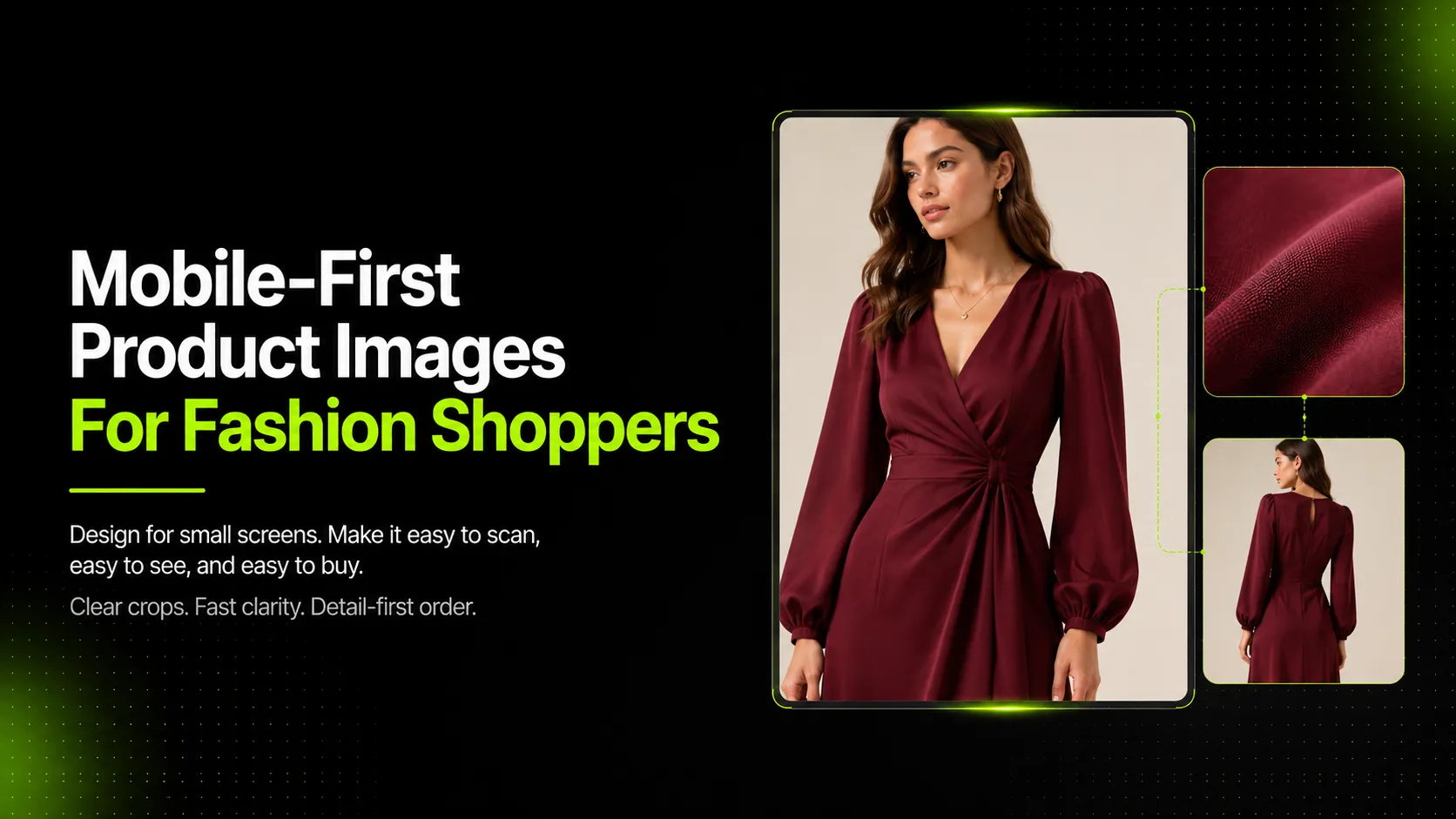
Mobile-first product images are planned for small-screen scanning, fast comparison, and easy product understanding before desktop adaptation. For fashion ecommerce, this matters because most shoppers first encounter a product on a phone. If the image does not read clearly at that size, the shopper moves on before the second image loads.
The issue is not whether your photos look good on desktop. The issue is whether they answer the right questions in the first three seconds on a 6-inch screen. This guide covers what mobile-first means for fashion product images, which images to lead with, how to crop for phone viewing, when to use each image type, and how AI can help produce mobile-specific variations without another full shoot.
Key Takeaways
- Mobile-first product images are designed for the phone screen outward, not cropped down from desktop assets after the fact.
- Fashion shoppers need fit, fabric, color, length, and detail cues early in the image sequence.
- Text overlays should be short, large, and positioned so they do not cover garment details.
- Image quality and file performance both matter. Google recommends balancing quality with page speed.
- AI can help create mobile-friendly crops, pose variations, and detail images, but every output needs product accuracy review.
What Makes A Product Image Mobile-First
A mobile-first product image reads clearly at phone size, answers the next shopper question quickly, and supports fast swiping, tapping, and zooming. It is not simply a smaller version of a desktop hero image.
It Reads Clearly at Phone Size
On a phone screen, a product image occupies roughly 400-500 pixels of vertical space before the shopper scrolls. If the garment is too small in the frame, or if the composition is too busy, the shopper cannot identify the product type, shape, or key feature in that window. According to Google's image SEO guidance, high-quality images appeal more to users, but images are also a large contributor to page size, so speed and quality both matter.
For fashion products, "reads clearly" means the silhouette, primary color, and product category are identifiable within one second of looking at the thumbnail or main gallery position.
It Answers the Next Shopper Question Quickly
Mobile shoppers swipe through galleries faster than desktop users. Each image should anticipate and answer the question the shopper is likely to ask next: What is the fit like? What is the fabric? How long is it? What does the back look like? If an image does not answer a clear question, it is filler, and filler images increase bounce risk on mobile.
It Supports Fast Swiping, Tapping, and Zooming
Mobile product images must render quickly enough that the shopper does not wait between taps. Shopify's ecommerce photography guide recommends multiple relevant angles and close-ups to help shoppers evaluate products, but those images also need to load fast enough to support rapid gallery navigation. Using responsive images with proper `width` and `height` attributes helps prevent layout shifts while images load, as web.dev's CLS guidance recommends reserving aspect-ratio space to prevent unexpected layout movement.
Mobile-First Product Image Priorities For Fashion
Fashion shoppers on mobile need to evaluate specific visual signals before they commit attention. Not all signals are equally urgent. The order below reflects what shoppers typically need first, though specific categories may shift based on the product type.
Product Type and Silhouette
The first image must make it obvious what the item is. A dress should look like a dress. A blazer should read as outerwear, not a shirt. On a small screen, ambiguous silhouettes cause the shopper to tap away rather than investigate further.
Fit and Body Position
After identifying the product, the shopper wants to understand fit. Is it oversized? Fitted? Cropped? Full-length? The image that shows fit should use a pose or angle that reveals the garment's relationship to the body without distortion. This is where pose variation matters: a standing front pose communicates different information than a walking side angle or a seated fit shot.
Fabric Texture and Material Behavior
Fabric texture is hard to judge on a phone if the product is too small in the frame or the lighting flattens the surface detail. Knit structure, linen weave, denim wash, and satin sheen each require enough resolution and crop tightness that the material behavior is visible when the shopper zooms partially.
Color Accuracy
Color looks different on phones than on calibrated monitors. The main product image should show the color under neutral lighting so the shopper's phone display does not shift the perception dramatically. Variant swatches should match the main image color as closely as possible.
Construction Details and Back View
Shoppers who reach the third or fourth image are usually interested enough to inspect construction. Seams, zipper placement, pocket depth, strap width, and back cutout details help the shopper evaluate quality and fit. These details matter more on mobile because the shopper cannot rotate the product physically.
Recommended Mobile Product Image Order
Gallery order on mobile is not arbitrary. The sequence should match the order of shopper questions, from identification to purchase confidence.
| Position | Image Job | Why It Belongs |
|---|---|---|
| Image 1 | Clear product identification | Establishes what the item is immediately |
| Image 2 | Model fit or full silhouette | Shows how the garment sits on a body |
| Image 3 | Fabric or detail close-up | Answers material and quality questions |
| Image 4 | Back view or side view | Reveals hidden construction details |
| Image 5 | Use case or styling context | Helps the shopper imagine wearing it |
| Image 6 | Measurement, care, or trust support | Reduces purchase hesitation |
Image 1: Clear Product Identification
Lead with the cleanest, most representative view of the product. For fashion, this is typically a front-facing model shot or a clean white-background product image that shows the full garment shape. Avoid lifestyle shots with busy backgrounds as the first image unless the product category specifically benefits from context (such as activewear in motion).
Image 2: Model Fit or Full Silhouette
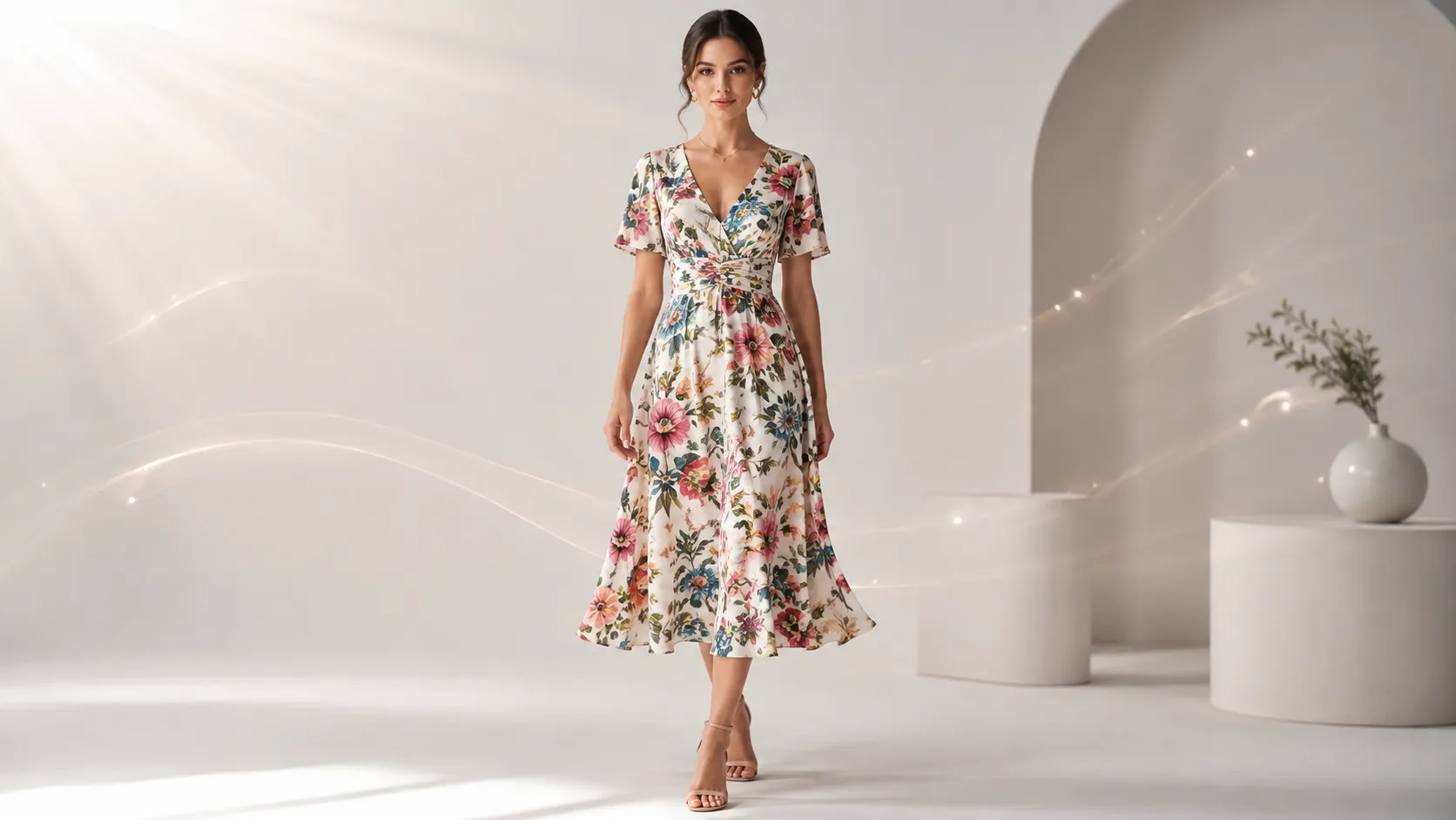
The second image should communicate fit. A full-length model image works well here because it shows length, proportion, and how the fabric drapes. If the first image was a product-only shot, the second image should include a body reference so the shopper can gauge scale.
Image 3: Fabric or Detail Close-Up
By the third image, the shopper is asking whether the material matches their expectation. A close-up of fabric texture, stitching, print detail, or hardware gives the shopper the tactile information they cannot get from the full-body shot.
Image 4: Back View or Side View
Fashion shoppers know that the front of a garment only tells half the story. A back view reveals neckline depth, strap placement, back cutout, hem shape, and overall construction balance. Side views show profile silhouette and layering potential.
Image 5: Use Case or Styling Context
After the shopper understands what the product is, how it fits, and what it is made of, they want to see it in action. A styled lifestyle image or a use-case shot (such as activewear in movement or a coat layered over other pieces) bridges the gap between product inspection and ownership imagination. For brands building multiple lifestyle visuals from one product photo, an AI Fashion Lookbook Generator can help turn a single product image into styled campaign variations suited for mobile use-case display.
Image 6: Measurement, Care, or Trust Support
The final slot in the core sequence can address remaining hesitation. Size guide references, care label visibility, material composition notes, or trust signals such as "true to size" or "runs small" annotations help the shopper move toward the add-to-cart decision.
Mobile Crop And Composition Rules
Cropping for mobile is not the same as cropping for desktop. A crop that looks balanced on a 27-inch monitor can cut off critical details on a phone.
Keep the Garment Large Enough to Read
The product should fill at least 60-70% of the frame height in the main product images. If the garment occupies less than half the frame, fine details become unreadable when the image renders at phone size. This is especially important for structured items like blazers and coats, where shoulder shape and lapel structure communicate quality.
Avoid Cropping Hems, Cuffs, Straps, or Key Design Details
Mobile gallery crops sometimes cut off the bottom of a dress hem, the cuff of a sleeve, or a thin strap. These omissions matter because the shopper uses hem length and strap visibility to evaluate coverage and fit. Review every image at phone size before publishing to confirm no critical design edge disappears off-screen.
Leave Safe Space for UI Overlays
Product pages on mobile often overlay UI elements such as variant dots, sale badges, or wishlist icons on top of the main image. If the product fills the entire frame edge-to-edge, these UI elements can cover garment details. Leave a small margin, especially at the top and bottom edges, so platform UI does not obscure the product.
Use Consistent Crop Systems Across Variants
When a product comes in multiple colors or patterns, every variant image should use the same crop, framing, and camera distance. Inconsistent crops across variants make comparison harder on mobile and can create the impression that the products have different shapes or fits.
When To Use Model, Product-Only, Detail, Or Lifestyle Images
Not every image type serves the same purpose. Choosing the right type for each gallery position helps the shopper move through questions efficiently.
| Mobile Shopper Need | Best Image Type | Fashion Example | QA Check |
|---|---|---|---|
| Identify the product quickly | Clean main image | Full garment or model front view | Product type is clear in a small thumbnail. |
| Understand fit | Model image or pose variation | Dress length, blazer shape, legging rise | Body proportions and garment fit are not distorted. |
| Inspect fabric | Detail close-up | Knit texture, linen weave, denim wash | Texture matches the real product and is not blurry. |
| Compare variants | Consistent grid/PDP crop | Same top in multiple colors | Crop, lighting, and color are consistent. |
| See hidden details | Back or side view | Straps, back cutout, side pocket | Key details are not cropped off. |
| Understand use case | Lifestyle or styled image | Linen outfit, activewear movement, coat layering | Styling does not confuse what is included. |
| Read product claims | Minimal text overlay | Stretch, pocket, lining, care note | Text is readable on a phone and does not cover the garment. |
Linen Dress Example
A linen dress has specific mobile image priorities: silhouette (shift vs. maxi vs. shirt dress), length (knee, midi, ankle), transparency (linen can be sheer in bright light), fabric texture (weave pattern, wrinkle behavior), and back view (button placket, seam line, open vs. closed back). Crop risk includes the hem being cut off on mobile or straps disappearing into a busy background. Any AI-generated linen dress image should be reviewed for color warmth and fabric opacity against the real product reference.
Compression Leggings Example
Compression leggings need to show waistband height, side pocket presence (if any), compression fit around the thigh and calf, movement capability, and seam placement. On mobile, a tight crop may hide the waistband logo or make the ankle length unclear. Pose variation matters here: a standing front pose shows compression mapping differently than a deep lunge or seated forward fold. AI outputs for leggings should be checked for distorted body proportions or exaggerated compression that does not match the actual product stretch.
Knit Sweater Example
A knit sweater's mobile image priorities include neckline shape (crew, V-neck, boat), sleeve volume (fitted vs. oversize), knit texture visibility (cable, rib, seed stitch), cuff and hem ribbing weight, and color warmth (cream, oatmeal, charcoal can shift between screens). The biggest mobile risk for knit products is texture becoming unreadable if the sweater is too small in the frame. Detail close-ups of the knit pattern are essential. AI-generated knit images should be verified for yarn thickness and stitch density consistency.
Structured Blazer Example
A structured blazer needs to communicate shoulder shape, lapel width and notch style, waistline suppression, button stance, and side-view tailoring. On mobile, a blazer can look boxy if the frame is too tight or indistinct if the product is too far from the camera. The side view is particularly important for blazers because it shows the front-to-back balance and sleeve pitch. AI outputs should confirm shoulder width, lapel shape, and button placement stay accurate to the original product reference.
Text Overlays And Infographics On Mobile
Text overlays can add useful information (size notes, fabric claims, care instructions), but they can also cover the exact details the shopper wants to see.
Keep Text Short
Mobile screens have limited horizontal space. A sentence that fits comfortably across a desktop hero image will wrap two or three times on a phone. Limit overlay text to 3-6 words per block. If you need to convey more information, put it in the product description or a dedicated info graphic below the gallery, not on top of the garment image.
Use Large Type and High Contrast
Overlay text should be at least 16-18px equivalent on a rendered phone screen, with high contrast against the background. Thin white text on a light garment, or dark text over a dark denim wash, becomes unreadable. Test overlays on actual phone screens, not just desktop previews.
Avoid Covering Fabric or Fit Details
Position text overlays in areas that do not hide critical garment information. The lower portion of the image, the upper corner outside the main product zone, or a dedicated banner area below the product work better than text centered directly over the fabric or fit point the shopper needs to inspect.
Test Readability on Real Phone Screens
Desktop previews are misleading for overlay legibility. Open the product page on at least two different phones (iOS and Android if possible) and check whether the text is readable in one second without zooming. If it is not, reduce the text amount, increase the size, or move the overlay.
Performance And SEO Basics For Mobile Product Images
Visual quality matters, but so does load speed. Slow-loading image galleries increase bounce rate on mobile, especially on cellular connections.
Use Responsive Images and Fallback Image URLs
Google recommends using standard HTML image elements with `srcset` and `picture` elements for responsive images, plus a fallback `src` attribute. This ensures that phones receive appropriately sized image files rather than downloading desktop-resolution images that slow down rendering.
Compress Images Without Making Details Blurry
Compression reduces file size, but aggressive compression can erase fabric texture, soften edges, and introduce artifacts around text or fine patterns. Find a compression setting that reduces file weight by 40-60% without making knit texture, print detail, or stitching unreadable when the shopper zooms.
Reserve Image Space to Reduce Layout Shifts
Images without explicit dimensions can cause Cumulative Layout Shift (CLS) as they load, pushing content down the page after the shopper starts reading. As web.dev recommends, set `width` and `height` attributes or use CSS `aspect-ratio` to reserve the correct space before the image finishes loading.
Use Descriptive Filenames and Alt Text
Google uses filenames and alt text as signals to understand image content. Use descriptive filenames (e.g., `linen-shirt-dress-front-view.jpg` rather than `IMG_001.jpg`) and write alt text that describes the product for accessibility and search indexing. Alt text should name the product type, color, and key visible feature.
How AI Can Help Create Mobile-First Fashion Product Images
AI tools can help fashion teams produce mobile-specific image variations, pose options, and detail assets faster than organizing additional shoots for every SKU or campaign variation. The workflow still requires human review, but AI can reduce the production burden when the target output is clear.
Generate Mobile-Friendly Crops and Variations
AI product photography tools can take an existing product reference and generate variations with different backgrounds, compositions, and crop ratios suited for mobile PDP displays. For example, iCreat AI's AI Product Photography tool supports up to 10 reference images and multiple aspect ratios, which makes it easier to generate both desktop-hero and mobile-optimized versions of the same product visual.
Create Pose Variations for Better Fit Communication
Fit is one of the hardest things to communicate on mobile, and one pose rarely tells the full story. An AI Pose Generator can produce multiple pose variations from a single input, giving shoppers standing, seated, walking, and angled views that reveal how the garment behaves in different positions. This is especially useful for leggings, dresses, and fitted tops where fit perception changes with body movement.
Generate Detail Images for Fabric and Construction
Detail close-ups are essential for mobile shoppers who want to inspect fabric and construction, but shooting individual detail shots for every SKU is time-consuming. An AI Fashion Detail Image Generator can help create fabric close-ups, construction shots, and white-background detail assets from existing product images. These generated details should always be reviewed against the real product for texture accuracy, color matching, and feature fidelity.
Review Outputs for Product Truth Before Publishing
AI-generated fashion images should pass the same accuracy review as photographed images. Check fit proportions, fabric texture, color warmth, logo placement, print alignment, stitching details, and overall product truth before any AI-generated image goes live on a mobile PDP. AI can accelerate production, but it does not eliminate the need for final review.
Mobile-First Product Image QA Checklist
Before publishing mobile product images for fashion, run through these checks. This list is tailored to high-risk publishable visuals where product accuracy affects shopper decisions.
Does the Image Read at Phone Size?
- [ ] Product type is identifiable within one second at phone thumbnail size
- [ ] Silhouette is clear and not confused with other product categories
- [ ] Primary color reads accurately on mobile screens
- [ ] The image is not too busy or cluttered for a small screen
Is the Garment Accurately Represented?
- [ ] Fit, length, and proportion match the real product
- [ ] Fabric texture is visible and accurate (knit density, weave, sheen)
- [ ] Color matches the physical product under neutral lighting
- [ ] Construction details (seams, zippers, buttons, pockets) are correct
- [ ] Logo, print, and trim placement align with the actual item
Are Text and Details Readable?
- [ ] Any text overlay is under 6 words and larger than 16px equivalent
- [ ] Text does not cover fabric, fit, or key design details
- [ ] Overlay contrast is sufficient for outdoor and low-light phone viewing
- [ ] Detail close-ups remain sharp when the shopper zooms partially
Does the Image Set Answer Shopper Questions in Order?
- [ ] Image 1 identifies the product clearly
- [ ] Image 2 shows fit or full silhouette
- [ ] Image 3 addresses fabric or detail
- [ ] Image 4 covers back view or hidden details
- [ ] Image 5 provides use case or styling context
- [ ] Image 6 supports decision-confidence (size, care, trust)
- [ ] No consecutive images repeat the same job
Are File Size and Layout Stability Considered?
- [ ] Images are compressed without losing critical fabric or detail clarity
- [ ] Responsive image attributes (`srcset`, `width`, `height`) are in place
- [ ] Image dimensions are reserved to prevent layout shift during loading
- [ ] Filenames are descriptive and alt text is present
- [ ] Gallery loads fast enough on a typical cellular connection
Frequently Asked Questions
What Makes a Product Image Mobile-First?
A mobile-first product image is designed for phone-screen visibility from the start, not cropped down from a desktop asset later. It reads clearly at thumbnail size, answers a specific shopper question, and renders fast enough to support rapid gallery swiping on cellular connections.
What Is the Best First Image for Mobile Fashion Shoppers?
The best first image is the clearest possible view of what the product is -- typically a front-facing model shot or clean white-background image that shows the full garment shape and silhouette. Avoid busy lifestyle backgrounds for the first position unless the product category specifically benefits from motion context (such as activewear).
Should Mobile Product Images Use Text Overlays?
Use text overlays sparingly on mobile product images. Limit each overlay to 3-6 words in large type (16px+ equivalent) with high contrast against the background. Position overlays outside critical garment areas so they do not cover fabric texture, fit information, or construction details that the shopper needs to inspect.
Can AI Create Mobile-First Product Images?
AI can help generate mobile-friendly crop variations, pose options for fit communication, and detail close-ups for fabric inspection. However, every AI-generated fashion image should be reviewed for product accuracy -- including fit proportions, fabric texture, color warmth, logo placement, and construction details -- before publishing to a mobile PDP.
---
If you already have product reference images and need to create mobile-first fashion product visuals, try iCreat AI's AI Product Photography tool to generate product photos, detail shots, pose variations, and campaign-ready visuals from your existing references. For pose-specific fit communication, the AI Pose Generator can produce multiple angles from a single input. For fabric and construction close-ups, the AI Fashion Detail Image Generator helps create supporting detail assets for mobile PDP galleries.