



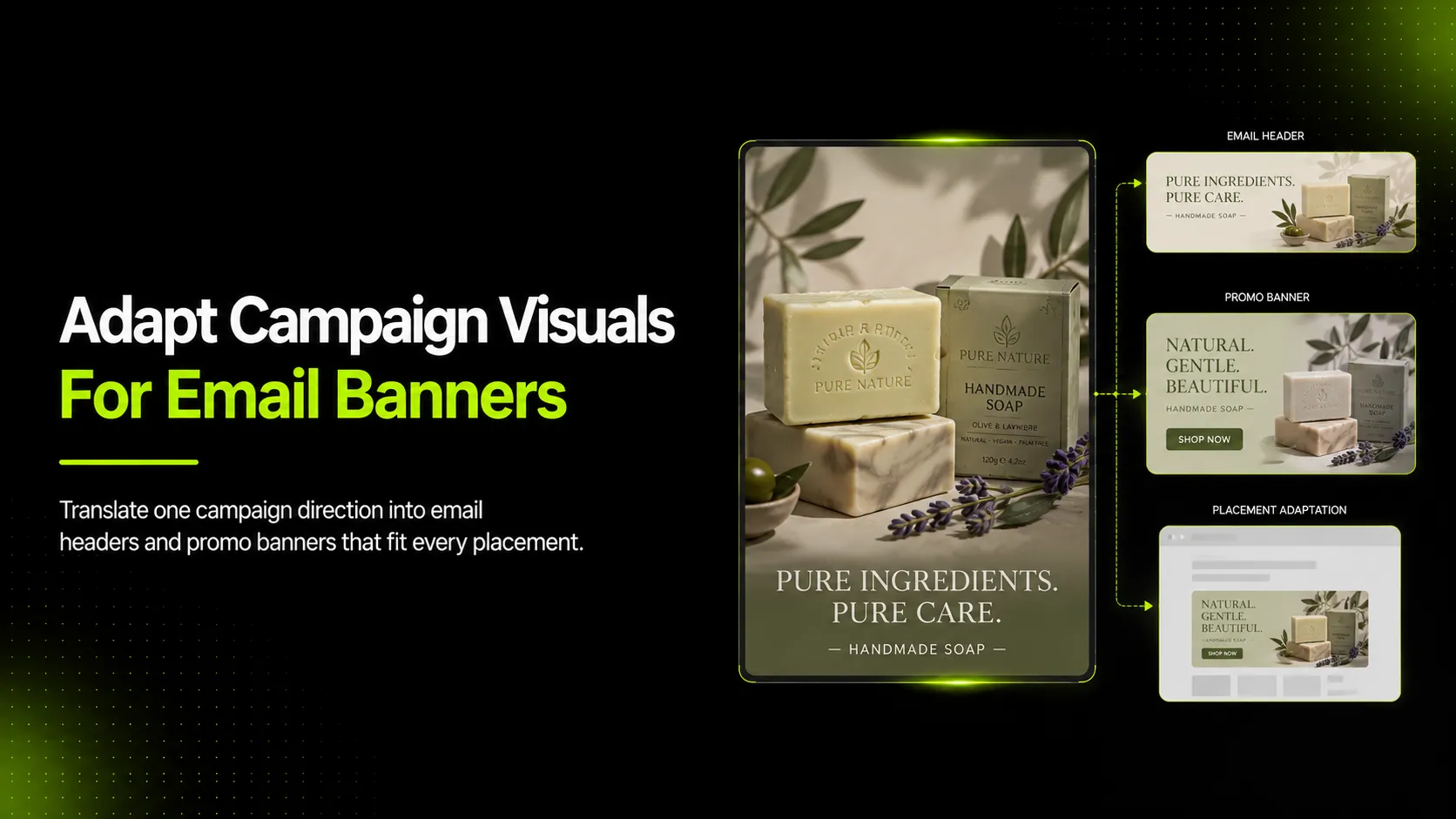
Translating campaign visuals into email header images and promo banners means taking a master campaign asset — a hero product shot, a seasonal key visual, or a launch creative — and adapting it for the specific constraints of each email placement. This is not resizing. It is re-cropping, re-composing, and sometimes re-generating so that each placement does its actual job: the header image stops the scroll and sets context, while the promo banner communicates the offer clearly enough to drive a click.
Most ecommerce teams already have campaign imagery from a photoshoot or a previous creative production. The gap is between owning that master visual and having placement-ready variants that work on mobile, preserve product accuracy, leave room for text or CTAs, and stay consistent with the rest of the campaign. This guide covers why direct reuse fails, how each email placement differs, what should stay consistent across variants, and a step-by-step workflow for turning one campaign visual into multiple email-ready assets.
Key Takeaways
- Campaign visuals need deliberate adaptation for each email placement, not simple resizing.
- Email header images, in-email promo banners, website banners, and ad banners each have different jobs and constraints.
- Product truth, offer clarity, mobile crop safety, and CTA space are the four non-negotiable checks for every variant.
- A repeatable workflow from master asset to placement-specific variants reduces last-minute creative gaps.
- AI tools like iCreat AI's AI Product Photography can help generate placement-specific product-led variants when the original campaign visual does not fit every format.
Why Campaign Visuals Need Translation Before They Become Email Assets
A campaign master visual is usually designed for a specific purpose: a homepage hero, a social post, a print ad, or a broad brand statement. That original composition makes assumptions about aspect ratio, focal point, text overlay area, and viewer distance that do not transfer automatically to email.
According to Mailchimp's email design guidance, effective email visuals should start with a clear goal, use readable layouts, balance text and visuals, and be optimized for mobile viewing. When you drop a wide homepage banner directly into an email header slot, several things typically break:
- Focal point shifts. The product or message that was centered in a 16:9 hero may end up cropped off-center in a narrower email header.
- Text-safe area disappears. The original visual may have been designed without accounting for a headline, subhead, and CTA button that the email template will layer on top.
- Mobile crop cuts the wrong part. What looks balanced on desktop can slice off the product entirely when viewed on a 320px-wide phone screen.
- Offer clarity gets lost. A subtle "summer sale" badge that works on a homepage hero becomes illegible when scaled down to email banner dimensions.
- Product detail vanishes. Fine details such as fabric texture, label text, or product shape become unreadable at smaller sizes.
Shopify's ecommerce email marketing guide notes that promotional emails for product releases, time-sensitive deals, subscriber discounts, and seasonal promotions perform best when the visual supports the specific message of that send. A generic campaign image reused across all of these types will underperform compared to placement-adapted variants because it is not doing the specific job each email needs it to do.
Map the Campaign Visual to Each Email Placement
Before adapting anything, identify which placements the campaign visual needs to serve. Each placement has a distinct job, aspect ratio, and set of constraints. Using the same composition for all of them means at least some placements will be compromised.
| Placement | Typical Size | Primary Job | Key Constraint |
|---|---|---|---|
| Email Header Image | 600–800px wide, 200–400px tall | Stop the scroll, establish campaign mood, support the subject line | Above-the-fold visibility; must work with or without image-on enabled |
| In-Email Promo Banner | 600px wide, 150–300px tall | Communicate the offer, drive click to landing page | Offer text and CTA must be readable; product must be recognizable |
| Website Promo Banner | Variable, often 1200×400px or similar | Announce sale or promotion site-wide | Must fit site grid; more horizontal real estate than email |
| Paid Social / Ad Banner | Platform-specific (1:1, 4:5, 16:9, 9:16) | Stop the feed scroll, communicate value proposition | Platform crop rules; thumb-stopping in crowded feed |
Email Header Image
The email header image sits at the top of the email body. Its job is contextual, not transactional. When a subscriber opens the email, the header should confirm they are in the right place, reinforce the campaign theme, and create visual momentum toward the first content block or CTA.
What works here:
- Strong campaign color or mood carried from the master visual
- Product visible but not necessarily the full hero composition
- Clean space on one side for the email headline if the template overlays text
- Mobile-safe crop where the key visual element stays within the center 60% of the frame
What fails here:
- Crowded compositions where text and product compete
- Fine details that disappear at 200–300px height
- Horizontal layouts where the important content sits at the far left or right edge
In-Email Promo Banner
The promo banner sits inside the email body, usually above or near the primary CTA. Its job is different from the header: it must communicate the specific offer (percentage off, free shipping, limited time, new arrival) and give the reader a reason to click.
What works here:
- Clear product shot with the item recognizable at small size
- Offer copy either baked into the image or positioned in adjacent text with strong contrast
- CTA button area that does not overlap with the product
- Consistent campaign color and styling
What fails here:
- Too much text inside the image (becomes unreadable on mobile)
- Product so small that shoppers cannot tell what is being sold
- Offer buried in visual noise
- Inconsistent styling that breaks the email's visual flow
Choose What Must Stay Consistent Across the Campaign
When you create placement-specific variants, some elements should stay locked and others can flex. Deciding this upfront prevents drift where each variant starts to look like it belongs to a different campaign.
| Element | Should Stay Consistent | Can Flex Between Placements |
|---|---|---|
| Primary product or hero item | Yes | Crop and zoom level |
| Campaign color palette | Yes | Color proportion and background treatment |
| Core offer message | Yes | Wording length and emphasis |
| Brand logo placement | Yes | Size and opacity |
| Background scene or setting | Sometimes | Simplified or removed for tighter crops |
| Secondary props or models | No | Add or remove based on space |
| Text overlay style | No | Reposition or move to HTML text |
For example, a linen dress seasonal campaign might use a warm terracotta palette, natural linen texture, and a relaxed summer mood across all variants. The email header uses a wider crop of the model wearing the dress against a soft outdoor background. The promo banner tightens to a product-first crop of the dress on a clean background with the offer "Up to 30% Off Summer Styles" in HTML text beside it. Both share the same color family and product, but the composition changes to fit each job.
Build Email Header Images from the Campaign Visual
Creating an email header from a campaign master visual requires three decisions: where to crop, whether to simplify the background, and where the text-safe zone sits.
Step 1: Choose the crop based on the email template width.
Most email templates render at 600px wide. If your master visual is a 1920×1080 homepage hero, a center crop at roughly 600×300 will capture the middle portion. Test the crop by previewing it at both desktop (600px) and mobile (320px) widths. If the product or key visual element shifts too far toward one edge on mobile, adjust the crop inward.
Step 2: Create headroom for text if your template overlays headlines.
Many email templates place the H1 headline over the header image. If your template does this, identify the text-safe area — usually the upper third or lower third of the image — and make sure that region has enough contrast and simplicity for white or dark text to sit cleanly. Avoid placing the product's face, label, or most important detail directly behind where the headline will render.
Step 3: Check dark-mode and image-blocked fallbacks.
Some email clients render headers with a dark mode inversion. Some subscribers have images disabled by default. Your header should not depend entirely on the image to convey meaning. The email subject line and preheader text should carry the core message even if the header image does not load.
For the linen dress campaign example, the master visual shows a model in a linen midi dress standing in a sunlit garden. The email header crop takes the upper two-thirds of the frame: model visible from the waist up, garden background softened, left side kept relatively open for the email headline "Your Summer Wardrobe Starts Here." On mobile, the crop tightens further to keep the dress fabric and color as the recognizable element.
Build Promo Banners from the Same Campaign Visual
Promo banners require a different set of priorities than header images. The offer must be clear, the product must be identifiable, and the CTA must have a logical home.
Step 1: Decide whether the offer lives in the image or in HTML text.
Baking offer text ("20% OFF", "Ends Sunday") into the image gives you precise control over typography and placement, but it hurts accessibility and can look pixelated on high-DPI screens. Using HTML text alongside a cleaner product image is more flexible and accessible, but it requires coordination between the image design and the email layout. For most ecommerce workflows, HTML text for the offer plus a product-focused image produces the cleaner result.
Step 2: Position the product for recognition at small size.
A promo banner might render at 150–250px tall. At that height, a full-body lifestyle shot becomes a colored smudge. Crop or recompose so the product fills enough of the frame to be recognizable. For apparel, this usually means a knee-up or waist-up crop rather than a full-body distant shot.
Step 3: Leave clear CTA space.
Whether the CTA is a button in the email layout or a designed element inside the image, the banner should not feel crowded. A useful rule: the product should occupy roughly 50–65% of the banner area, with the remaining space reserved for offer text, CTA, and breathing room.
For a skincare bottle set promotion, the master visual might show three skincare bottles arranged on a marble surface with soft lighting and botanical accents. The promo banner variant simplifies this: bottles arranged horizontally in a clean row, marble background reduced to a subtle gradient, and the offer "Complete Routine Bundle — Shop Now" placed as HTML text to the right or below the product. The labels on the bottles must remain readable enough that the shopper can identify what is included.
Step-by-Step Workflow for Creating Email and Banner Variants
Use this workflow each time you need to adapt a campaign visual for email and promotional use.
Step 1: Audit the master campaign visual.
Identify the product, the key visual elements, the color palette, the text or branding present, and the current aspect ratio. Note any details that matter for accuracy: label text, product count, material appearance, included accessories.
Step 2: List every placement that needs a variant.
Write down each placement, its required size, its primary job, and any template constraints (text overlay area, safe zone, platform crop rules). This list prevents the common problem of creating variants for email but forgetting the website banner or the social ad version.
Step 3: Decide what stays consistent and what flexes per the consistency table above.
Lock the product, campaign colors, core offer, and brand elements. Allow background, props, text treatment, and crop to change per placement.
Step 4: Create the email header variant first.
Crop for 600px width. Test at 320px for mobile. Verify text-safe area if applicable. Check dark-mode appearance. Save the header export.
Step 5: Create the promo banner variant second.
Tighten the crop for product recognition at smaller height. Separate offer text decision (image vs. HTML). Position CTA space. Verify product accuracy (labels, count, details). Save the banner export.
Step 6: Create additional placement variants if needed.
Website promo banner, social ad crop, or retargeting banner each get their own pass using the same locked-consistent elements.
Step 7: QA each variant against the checklist in the section below.
Run through every check before handing assets to the email team or uploading to the ESP.
Common Mistakes When Adapting Campaign Visuals
These mistakes appear regularly in ecommerce email programs. Each one has a straightforward fix.
| Mistake | Why It Hurts | Fix |
|---|---|---|
| Resizing the master visual without re-cropping | Focal point shifts, product becomes unrecognizable on mobile | Recompose each variant for its target size and aspect ratio |
| Baking too much text into the banner image | Text becomes illegible on mobile; hurts accessibility; looks pixelated on retina screens | Move offer copy to HTML text; keep images product-focused |
| Ignoring the mobile crop | Key visual content falls outside the 320px viewport; subscriber sees only empty background | Center-weight compositions; test every variant at mobile width |
| Losing product accuracy in the adaptation | Labels blur, bundle count becomes unclear, product shape distorts, implied features are not actually included | Review every variant for product truth before publishing |
| Using the same variant for header and promo banner | Header image tries to do too many jobs; neither placement performs well | Give each placement its own composition tailored to its specific role |
| Not testing with images disabled | Subscribers who block images see no visual context, no offer, no reason to engage | Ensure subject line, preheader, and alt text carry the message independently |
| Inconsistent color or styling across variants | Campaign feels disjointed; brand recognition weakens | Lock color palette and core styling elements before starting variant production |
Quality-Control and Consumer Trust Checks
Because this article concerns adapted visuals used in email and promotional placements where product truth, offer clarity, and customer expectations directly affect trust and conversion, run these checks on every variant before it goes live.
Product shape and proportions. Does the product look correct in the variant? Has cropping distorted the silhouette, stretched the proportions, or cut the product in an awkward position? For a sneaker launch banner, the toe box and heel should both be recognizable and proportionally accurate.
Color and material accuracy. Does the variant preserve the actual product color? A linen dress that reads as mustard yellow in the master visual but as orange in the email banner creates a mismatch between expectation and product page. Material texture should still read as linen, not silk or cotton.
Logo, label, or packaging readability. For the skincare bottle set example, can the subscriber read the product names on the labels? If the banner implies a three-bottle routine, are all three bottles clearly visible and identifiably different? If the original master visual had readable labels and the banner variant does not, the variant may mislead.
Offer and discount framing. Does the banner imply a discount, bundle, or inclusion that the landing page actually supports? If the banner says "Complete Set" but the landing page sells items individually, shoppers will feel misled. If the banner shows "20% Off" but the code applies only to full-price items, the disconnect damages trust.
Text-safe area and CTA readability. Is there enough contrast where text or buttons will render? Will the CTA button overlap with the product's most important detail? Test with actual email client rendering, not just in a design tool.
Mobile crop and fallback behavior. Open the email on a 320px-wide simulator. Is the product still visible? Is the offer still readable? Disable images in the preview. Does the email still communicate its message through alt text, preheader, and layout structure?
Dark-mode compatibility. Preview the header and banner in a dark-mode simulation. Do the colors invert badly? Does the product disappear against a dark background? Adjust contrast or provide fallback solid-color backgrounds where needed.
If your team already has campaign images and needs email-ready header and promo banner variations, iCreat AI's AI Product Photography workflow can help generate new product-led compositions from approved references while keeping the final review focused on crop, text space, and product accuracy. This is especially useful when the original campaign visual does not have a clean product-first version, or when you need background variations, color adaptations, or additional product angles that the original shoot did not capture.
FAQ
Log in to iCreat AI when you're ready to generate product-led email header and promo banner variations from your existing campaign visuals: https://icreat.ai/login.