



A strong Shopify collection page image strategy helps shoppers scan a category quickly, understand the collection mood, compare products, and click into the right product detail page. For fashion brands in 2026, the collection page should not be treated as a random product grid. It should work like a visual merchandising system that connects campaign imagery, product cards, hover images, and PDP assets.
Shopify's collection documentation describes collections as a way to group products so customers can find them by category, such as clothing for men, women, or children, sale items, products in a certain size or color, or seasonal products. Shopify also notes that collections can be displayed as webpages with a gallery of products, and shoppers can click product images on collection pages to visit specific product pages.
That means collection images have a specific job: they need to help shoppers choose what to inspect next. This guide explains how fashion brands should plan collection hero images, product grid cards, hover images, lifestyle tiles, and AI-assisted collection assets without losing product accuracy.
Key Takeaways
- Collection pages are visual merchandising pages, not just product lists.
- Product grid images need consistency, but not every collection needs identical shots.
- Fashion brands should decide when to use model images, product-only images, lifestyle tiles, and detail-led hover images.
- Collection visuals should lead naturally into PDP images so the shopper does not feel a mismatch after clicking.
- AI can help scale collection visuals, but product accuracy and brand consistency still need review.
What A Shopify Collection Page Image Strategy Needs To Do
A Shopify collection page image strategy needs to help shoppers scan, compare, and choose. The page has a different job from a PDP. A PDP explains one product in depth. A collection page helps shoppers decide which product is worth opening.
For fashion brands, this creates three visual priorities.
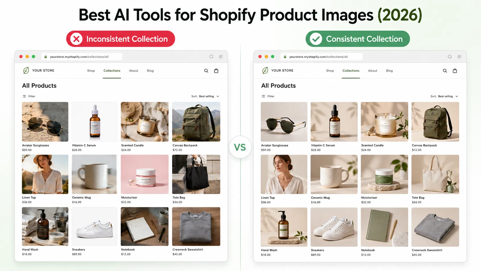
First, the page must be scannable. A shopper should understand the category, product type, and style range without studying each card. If every product image has a different crop, pose, background, and lighting style, the grid becomes harder to compare.
Second, the page needs a clear collection mood. A spring linen collection, knitwear drop, sale collection, and capsule lookbook should not all feel the same. The mood can come from the hero image, occasional lifestyle tiles, color palette, styling direction, and product sequencing.
Third, the images should support the click into the PDP. The shopper should not click a product card expecting one garment and land on a PDP that looks visually unrelated. Collection images and PDP images should feel connected through color, crop, model styling, and product truth.
Collection Hero Image vs Product Grid Image
Collection pages usually have several visual layers. The most important distinction is between the collection hero image and the product grid image.
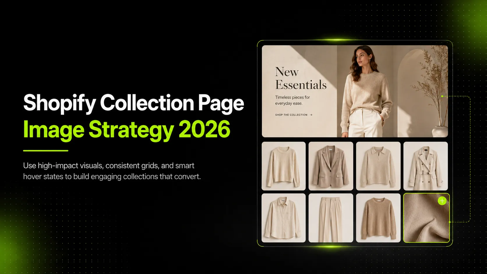
The collection hero image sets the mood or category promise. For a summer linen collection, it might show a relaxed model scene in warm natural light. For a sale collection, it might be simpler and more product-forward because shoppers are browsing quickly. For a capsule lookbook, it might feel editorial, showing the full story of the collection.
The product grid image is more functional. It should help shoppers compare individual products. A grid image needs to show enough product information to support fast decisions: silhouette, color, shape, styling, and category. It should not be so editorial that the product becomes hard to identify.
Hover images can bridge the gap. A hover state can show the back view, a model pose variation, a fabric close-up, or a styled version of the garment. Used well, hover images help shoppers learn something useful before leaving the collection page.
The mistake is making every visual do the same job. Hero images can carry mood. Product cards should carry comparison. Hover images can carry quick secondary information. PDP images should carry deeper product evaluation.
The 2026 Fashion Collection Image Framework
Fashion collection pages should be planned by collection type. A single image system will not work equally well for every merchandising context.
Category Collections
Category collections include pages such as dresses, tops, denim, outerwear, or activewear. These pages need high scan clarity. Product grid images should be consistent enough that shoppers can compare silhouettes, colors, and styles quickly.
Use clean model images or product-only images as the default. Save heavy editorial imagery for the hero or supporting tiles.
Seasonal Drops
Seasonal drops need stronger mood. A spring linen drop, holiday partywear page, or winter knitwear release should feel connected through color, styling, and atmosphere.
Use the hero image to set the campaign direction. Keep the grid consistent enough that shoppers can still compare products. Hover images can show fabric, back view, or an alternate styled pose.
Sale Collections
Sale collection pages are usually more decision-driven. Shoppers want to browse quickly, compare items, and find the right size or style.
Use product-first thumbnails, clear crops, and minimal visual distraction. Avoid making sale collection imagery so editorial that it slows down comparison.
Capsule Or Lookbook Collections
Capsule and lookbook collections can support more styling. These pages often sell an outfit idea, seasonal mood, or brand story, not just individual SKUs.
The key is to keep the product click path clear. If a model wears a full outfit, make sure the product card still identifies the item being sold. Do not make a collection card look shoppable if it is only a mood image.
Color Or Material-Based Collections
Material and color collections need extra accuracy. A linen edit, denim collection, neutral capsule, or knitwear page depends on shoppers trusting color, texture, and fabric behavior.
Use grid images with aligned white balance and consistent crop. Detail-led hover images can work well here, but do not replace product-identification images with vague texture shots.
Product Grid Image Rules For Fashion Brands
Product grid images should make comparison easier. They do not all need to be identical, but they do need a system.
Keep crops consistent enough to compare products. If one dress is cropped at the knees, another at the shoulder, and another as a full-body shot, shoppers have to work harder to compare length and silhouette. Choose a crop logic by category, such as full-body for dresses, upper-body for tops, or waist-to-ankle for trousers.
Use model poses intentionally. A consistent pose system can make a collection feel cleaner and easier to scan. For example, a brand might use front-facing model poses as default grid images and side or back views as hover images. For activewear, a movement pose may be useful, but only if it still shows the garment clearly.
Keep backgrounds and lighting aligned. You can vary mood across seasonal campaigns, but a single collection page should not feel like several unrelated shoots were mixed together. Background, lighting, model scale, and crop all affect perceived brand quality.
Preserve color accuracy across the grid. This is especially important for fashion because color mismatch between collection page and PDP can create distrust. A cream dress should not look white in the grid and beige on the PDP. A black knit should not lose texture because the grid image is too dark.
Design for mobile scanning first. Many shoppers will see a collection page in a narrow grid, where small image differences become harder to read. Product shape, color, and category should be clear at small sizes.
When To Use Product-Only, Model, Lifestyle, Or Detail Images
Use different image types based on the role each image plays in the collection page.
| Collection Image Role | Best Image Type | Use For | Watch Out For |
|---|---|---|---|
| Collection hero | Campaign or lifestyle image | Setting mood for seasonal drops, capsules, or category pages | Do not hide the product category or make the collection unclear. |
| Product grid default | Clean model or product-only image | Fast comparison across SKUs | Avoid inconsistent crops, model scale, and background styles. |
| Hover image | Alternate angle, back view, detail, or styled image | Showing fit, detail, or use without forcing another click | Keep it useful, not decorative. |
| Lifestyle tile | Editorial or use-case image | Breaking up long grids or communicating collection mood | Do not make it look like a shoppable product if it is not. |
| Sale collection image | Clear product-first image | Price-driven browsing and fast comparison | Avoid over-styled images that slow decisions. |
| Lookbook collection image | Styled model or campaign image | Capsule, seasonal, or brand-led collection storytelling | Ensure product click path remains clear. |
| Detail-led collection image | Fabric/detail crop as support, not default | Material-focused collections such as linen, denim, knitwear | Do not replace product-identification images with vague texture shots. |
Shopify's ecommerce photography guide identifies image types such as white background, lifestyle photography, packaging, close-up, and group shots. On collection pages, the important question is not which image type looks best in isolation. It is which image type helps the shopper understand the collection and choose the next product to inspect.
Fashion Collection Examples
The strategy becomes clearer when applied to real collection types.
Summer Linen Collection
For a summer linen collection, the hero image should communicate ease, texture, and seasonality. A relaxed lifestyle or lookbook image can set the mood without needing every product card to feel editorial.
The product grid should use consistent model or product-only crops for shirts, trousers, skirts, and dresses. Hover images can show fabric texture, transparency, side view, or back view. Color accuracy matters because linen tones can shift easily under different lighting.
Knitwear Drop
A knitwear drop benefits from a cozy seasonal hero image, but the grid still needs product clarity. Use consistent model crops that show neckline, sleeve shape, length, and silhouette.
Hover images can show ribbing, cuff detail, knit texture, or a back view. Review AI-generated or edited images carefully so they do not change knit density, yarn thickness, garment volume, or color warmth.
Sale Collection
A sale collection should prioritize speed. The hero can be simple: a clean promotional image, category image, or product-led banner. The grid should make product comparison fast.
Use product-first thumbnails, consistent crop, and clear color presentation. Hover images can show a quick alternate angle or fit cue. Avoid using overly styled editorial images that slow browsing or make sale products harder to compare.
Capsule Lookbook Collection
A capsule lookbook collection can use more editorial imagery because the collection story matters. The hero image should show the styling direction and mood.
The grid can use model images that feel consistent but still identify each product clearly. Hover images can show styled outfit variations or detail shots. The main risk is product ambiguity: if the model wears several items, the card should still make it clear which item the shopper will click.
How AI Can Help Scale Shopify Collection Page Images
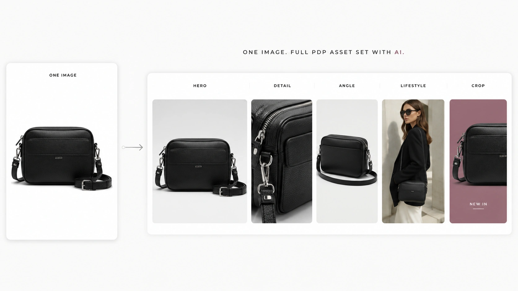
AI is useful for Shopify collection page image strategy because fashion brands often need more visuals than a single shoot can efficiently produce. A collection page may need a hero, grid defaults, hover images, alternate poses, detail visuals, and campaign variations.
iCreat AI's AI Product Photography can help turn product references into ecommerce visuals for collection grids, PDPs, and campaign use. This is useful when a brand needs enough visual consistency across many SKUs without planning a new production setup for every image.
Use AI Fashion Lookbook Generator when the collection needs campaign or capsule imagery. This fits seasonal drops, collection heroes, editorial tiles, and lookbook-style visuals.
Use AI Pose Generator when the collection grid needs consistent model pose variations. Pose consistency can help shoppers compare garments without feeling like they are browsing images from unrelated shoots.
Use AI Fashion Detail Image Generator when hover images or PDP transitions need fabric close-ups, product details, back views, or apparel detail assets.
The workflow should stay grounded:
- Define the collection type: category, seasonal, sale, capsule, material, color, or campaign.
- Choose the visual system: hero, grid default, hover, lifestyle tile, PDP handoff.
- Gather source assets: product images, model references, detail shots, color references, and brand mood references.
- Generate or adapt visuals where speed and variation matter.
- Review the full collection for crop, pose, color, background, product truth, and mobile scanning.
AI can scale collection visuals, but it should not invent missing product details. The final collection page still needs human review.
Common Collection Page Image Mistakes
The most common collection page image mistakes are not technical. They are merchandising mistakes.
Overly mixed crops and backgrounds. A category page looks weaker when every image uses a different crop, model distance, lighting condition, and background. Variation is useful, but unplanned variation makes comparison harder.
Lifestyle imagery that hides the product. A lifestyle image can set mood, but it should not make the product hard to identify. If the product is too small, obscured, or surrounded by distracting styling, use it as a hero or editorial tile instead of a product grid default.
Inconsistent model poses across similar SKUs. If one pair of trousers is shown standing, another seated, and another cropped at the hip, shoppers cannot compare fit quickly. Pose systems are especially useful for categories like dresses, trousers, activewear, and outerwear.
Color mismatch between collection page and PDP. A shopper should not click a product card and feel like the product changed color. Keep lighting, white balance, and edit style consistent enough that the transition feels trustworthy.
Slow, oversized image files. Shopify's ecommerce photography guide discusses image compression and page-load considerations. Collection pages often contain many images, so file weight matters. Avoid using larger files than the page experience needs, and verify technical specs with current Shopify documentation before publishing.
Shopify Collection Page Image Checklist
Use this checklist before publishing or refreshing a fashion collection page.
- The collection story is clear from the hero or first screen.
- The product grid is easy to scan on mobile.
- Product card crops are consistent enough for comparison.
- Model pose and scale feel intentional across similar SKUs.
- Product colors match PDP images closely.
- Fit, fabric, print, logo, and styling props are accurate.
- Hover images add useful information, such as back view, detail, or styling variation.
- Lifestyle tiles do not look like product cards unless they are clickable products.
- Collection images lead naturally into PDP images.
- Image file weight and loading are considered before publishing.
If the collection page looks beautiful but makes product comparison harder, the image strategy needs adjustment. A fashion collection page should create desire and help the shopper choose.
FAQ
Conclusion
Shopify collection page image strategy is about helping shoppers move from browsing to product selection. The collection page should set the mood, make the grid easy to scan, support comparison, and lead naturally into PDPs.
For fashion brands in 2026, this means planning collection hero images, product grid defaults, hover images, lifestyle tiles, and detail assets as one system. Use AI where speed and variation matter, but keep product truth and brand consistency at the center.
If your team already has product references and needs to scale Shopify collection visuals, use iCreat AI's AI Product Photography to create ecommerce product images, then pair it with lookbook, pose, and detail workflows when the collection needs more visual depth.