




What Brand Consistency in Product Imagery Actually Means
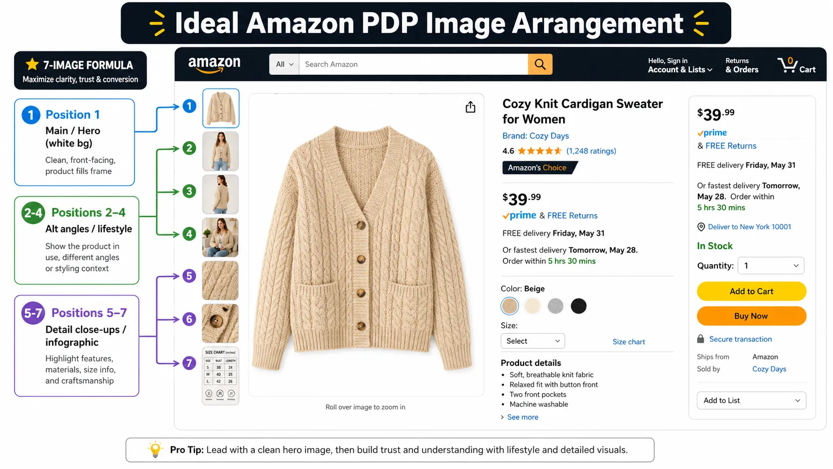
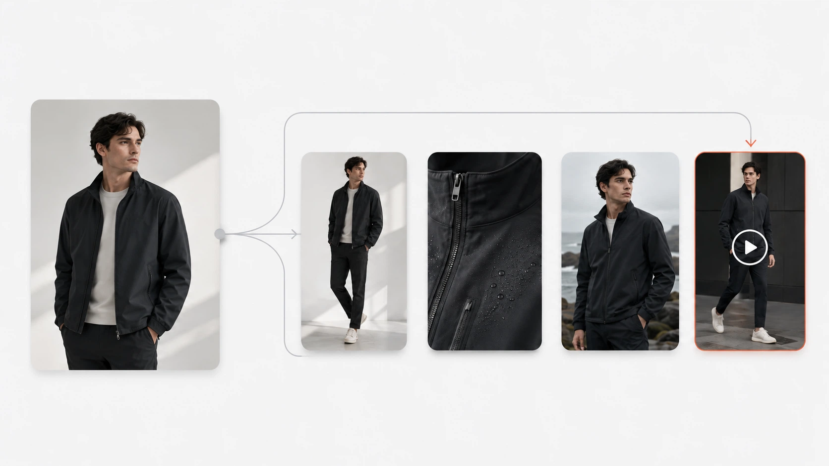
Brand consistency in product imagery does not just mean using the same logo or the same general color palette. In practice, it means customers should see a coherent visual system across the whole image set.
For a skincare bottle, that might mean the same clean lighting direction, background style, packaging visibility, and crop logic across every SKU. For a handbag brand, it may mean the same premium tone, similar contrast, repeatable angle choices, and stable hardware visibility. For a sneaker campaign, it may mean consistent shadow style, background treatment, and color handling across multiple product variations. For a t-shirt catalog, it may mean the same garment framing, fit presentation, and texture visibility from one product page to the next.
That is why consistency is a workflow issue before it is a design issue. If every image is created from scratch with a different process, teams end up fixing inconsistency manually later.
Xtensio's brand consistency guide is useful here as a framing source. It emphasizes that consistency is ultimately about recognition and trust, not just design neatness. In product imagery, that principle becomes practical: shoppers trust what feels coherent and intentional, especially when they are comparing multiple products or variants side by side.
Which Tools Affect Product Image Consistency Most
The strongest tools for consistency usually fall into three categories.
| Tool type | What it helps control | Where it helps most | Main weakness |
|---|---|---|---|
| General image models | concept direction, scene exploration, rough variation | campaign ideation and moodboards | weaker product repeatability and exact detail control |
| Editing-first tools | cleanup, resizing, cropping, background control | repeated asset prep and production cleanup | may still need stronger product-specific structure |
| Product-focused AI workflows | repeatable product-based generation and controlled variation | ecommerce product marketing and product-facing asset sets | less open-ended for pure creative experimentation |
This is the first practical filter. If the team is still exploring visual direction, a general model may be enough. If the team is trying to keep many product images aligned over time, editing-first or product-focused workflows are usually stronger.
Shopify and Adobe both reinforce the same production logic from a broader photography perspective: consistent lighting, repeatable backgrounds, and clear product presentation are what make ecommerce image systems usable. A tool that cannot preserve those patterns consistently will not solve the real scaling problem.
Best Tools for Different Consistency Jobs
Best for concept consistency
If the job is defining a visual direction before production, general image models can help. A team may use them to explore whether a sneaker launch should feel sport-driven or editorial, whether a handbag brand should lean warm luxury or cooler minimalism, or whether a skincare line should feel clinical or spa-like.
These tools can create visual direction quickly, but they are not usually the strongest option once consistency must survive across many final assets.
Best for repeatable product marketing consistency
If the goal is to create more consistent product-centered marketing images from real product inputs, product-focused workflows are usually stronger. This is where AI Product Photography becomes more useful than a general image model alone. The workflow starts from approved product imagery and helps the team create more repeatable outputs without rebuilding the entire visual logic every time.
For a skincare bottle set, that can mean cleaner consistency across white-background hero images, softer PDP-supporting variations, and ad-ready crops. For a handbag range, it can mean stable framing and lighting across several hero and campaign variants. For sneakers, it can mean better consistency across repeated crops and product-led background changes. For a t-shirt line, it can mean cleaner background handling and more stable category presentation from one garment to the next.
Best for cleanup and formatting consistency
If the biggest inconsistency problem happens after the image already exists, editing-first tools matter most. Background Remover and Image Upscaler are useful because they help standardize repetitive cleanup steps that otherwise vary from asset to asset.
This kind of consistency work is less glamorous than generation, but often more important. Background quality, crop discipline, and final export quality do a lot of the heavy lifting in whether a catalog feels professionally managed.
Where Consistency Still Breaks Even With AI
This is where teams often confuse visual similarity with real consistency.
Color drift
If product colors shift from one image to another, the whole image set starts to feel unreliable. A skincare bottle line can look fragmented if bottle tones vary subtly. A sneaker can look like a different release if color blocking changes. A handbag can lose its premium cohesion if leather tone fluctuates too much between frames.
Detail drift
Consistency is not just tone and lighting. It is also whether small details remain stable. Hardware, stitching, edges, label spacing, or panel structure can drift enough that the image set still looks stylistically related while becoming less believable.
Workflow fragmentation
The biggest hidden problem is operational. If one part of the team uses a general image model, another edits manually, and another exports for channels with different assumptions, inconsistency creeps in even if each individual image looks fine.
Photoroom's tooling comparison content is useful here not as an ultimate authority, but because it repeatedly frames workflow integration and product-aware editing as more important than raw image novelty. That logic is sound: the more fragmented the workflow, the harder consistency becomes.
What to Review Before Publishing a Consistent Image Set
Consistency only matters if the final image set is still trustworthy.
Before publishing, review:
- Product shape: does the shape stay stable across the whole set?
- Color accuracy: do all images represent the product color consistently?
- Logo placement: are logos and visible brand marks staying correct?
- Material or texture consistency: do the images preserve believable surface detail across variations?
- Cropping and framing consistency: does the set follow one visual system, not several unrelated ones?
- Target channel requirements: will the final assets still work where they are being published?
- Shopper trust: does the image set feel consistent without becoming misleading?
Google Merchant Center's image guidance reinforces the same principle from a platform perspective: product images should accurately display the product and avoid misleading presentation. That means a visually consistent set can still fail if it standardizes the wrong thing. Consistency should support product truth, not replace it.
FAQ
Conclusion
The best tools for maintaining brand consistency in product imagery are the ones that help teams repeat the right decisions, not just generate attractive visuals faster. Strong consistency comes from workflow control, reusable visual logic, disciplined cleanup, and final review that protects product truth.
If your team needs more repeatable product visuals from approved product images, a product-focused workflow is usually a stronger fit than a general image model alone. The strongest systems do not just make one image look on-brand. They make the whole image set feel like it belongs together.