



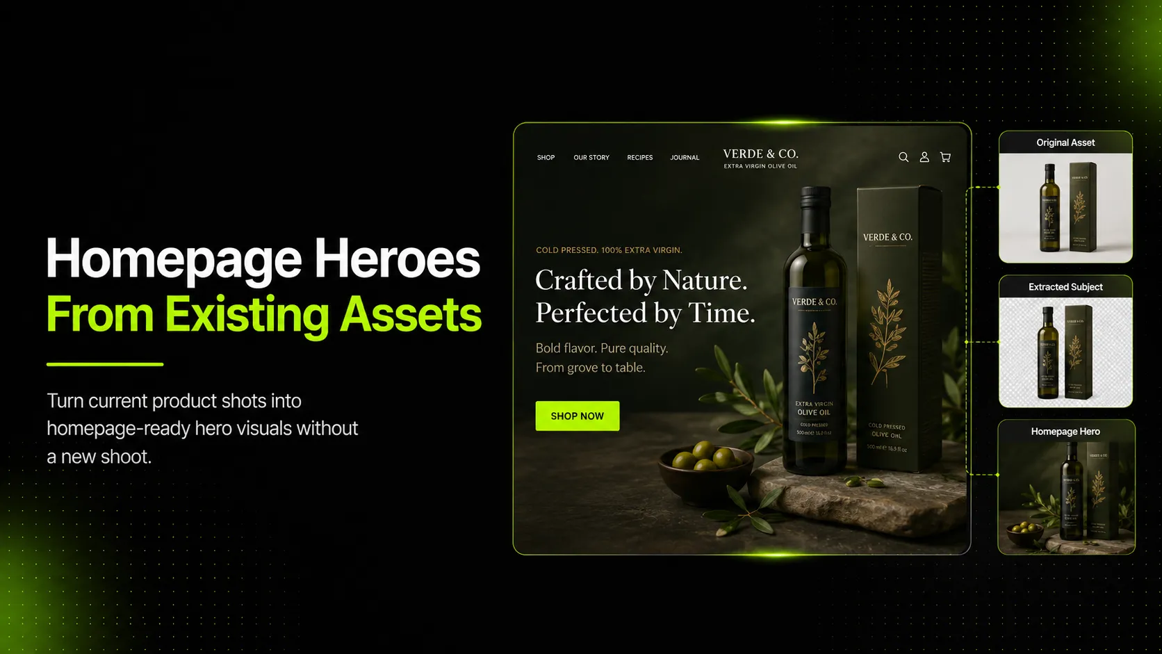
To create homepage hero visuals from existing product assets, start by choosing the product image, PDP asset, lookbook shot, or detail reference that best supports the homepage goal. Then rebuild it into a hero composition with a clear message, CTA-safe space, desktop and mobile crops, and a final product-accuracy review.
The mistake is treating a homepage hero as a wider product photo. A PDP image helps shoppers inspect a product. A homepage hero has a different job: it has to introduce the brand, route visitors toward the right collection or offer, and make the product feel worth exploring without misleading shoppers.
Key Takeaways
- Existing product assets can become homepage hero visuals, but they usually need new composition, copy space, and responsive crop planning.
- PDP images, collection images, ads, and homepage heroes serve different jobs.
- The strongest source assets are clear, accurate, high-resolution, and connected to the hero's campaign goal.
- AI can help generate product-led hero variations, but teams still need review for product truth, crop safety, and mobile fit.
- Do not claim conversion lifts or publish AI-generated hero visuals without checking product accuracy and customer expectations.
Why Homepage Hero Visuals Need a Different Job Than PDP Images
A homepage hero visual sits at the entrance to the shopping experience. It is not just decoration above the fold. It tells visitors where they are, what the brand is focused on, and what action they should take next.
That is why a PDP image rarely works as a homepage hero without changes. PDP images are usually built for inspection: clear product view, accurate details, zoom support, and minimal distraction. Homepage heroes are built for orientation: campaign story, product discovery, category routing, and visual hierarchy around a CTA.
Shopify's homepage design guidance frames homepage design around brand identity, product discovery, trust, UX, mobile friendliness, and calls to action. Its ecommerce photography guide also separates catalog photos from detail shots, noting that catalog images help people click while product page detail shots help them decide.
That distinction matters when you repurpose assets. A clean white-background skincare bottle image may be excellent for a PDP, but a homepage hero may need more context: a product set, a bathroom shelf scene, a launch message, or space for a headline. A model image of a linen dress may work on a PDP, but a homepage hero may need a wider setting, seasonal mood, and clear collection routing.
The goal is not to make the product asset less accurate. The goal is to give it a different job.
Audit the Product Assets You Already Have
Before creating anything new, audit what you already have. Most ecommerce teams have more usable hero source material than they realize, but it is scattered across PDP folders, campaign shoots, UGC folders, lookbook files, and ad creative archives.
Look for these asset types:
- Clean PDP images: front view, side view, back view, packaging shot, product-only image
- Product cutouts: transparent PNGs, white-background assets, isolated product images
- Detail images: fabric texture, label, logo, stitching, hardware, ingredients, packaging close-up
- Lifestyle images: model photos, room scenes, outdoor scenes, product-in-use images
- Lookbook or campaign references: approved mood, color palette, styling, pose, setting, lighting
- Video frames: strong stills from short-form product videos or campaign clips
Then score each asset by usefulness:
| Asset Check | Why It Matters for Homepage Heroes |
|---|---|
| Product is recognizable | visitors should understand what is being promoted quickly |
| Product is accurate | the hero should not change color, shape, material, or included items |
| Image has enough resolution | hero crops need room for desktop and mobile layouts |
| Background can be extended or replaced | cramped source images are harder to adapt into banners |
| There is space for copy or CTA | a hero visual must work with text, not fight it |
| Styling matches the campaign | a launch hero, sale hero, and brand hero need different visual tone |
For a linen dress collection, a full-body PDP image might show product truth. A lookbook reference might show the mood. For a skincare bottle set, a clean product cutout may be the safest product source, while a bathroom shelf image can provide context. For a sneaker, a side-angle product image may preserve shape, while a street-style reference can guide campaign energy.
Choose the Right Hero Visual Type for the Homepage Goal
Do not start with the image format. Start with the homepage job.
| Homepage Goal | Best Hero Type | Best Source Assets | Watch Out For |
|---|---|---|---|
| Launch a new collection | collection hero | lookbook shots, model images, product group shots | making the collection look broader than it is |
| Promote one flagship product | product-first hero | cutout, PDP image, detail shot, packaging image | over-styling until the product becomes secondary |
| Create seasonal mood | lifestyle hero | campaign reference, model shot, product-in-use image | context that implies a false use case |
| Route visitors by category | multi-product or category hero | category images, bestsellers, collection tiles | too many products competing for attention |
| Announce a sale or drop | message-led hero | product cutout, campaign image, simple background | cluttered text and weak CTA contrast |
| Build brand trust | story-led hero | founder image, production image, ingredient/material image | losing product clarity entirely |
The hero type should also match how familiar visitors are with the product. If the product is new, technical, or visually unfamiliar, a product-first hero is usually safer than a vague lifestyle scene. If the brand is selling a mood-driven fashion collection, a lifestyle or lookbook-style hero may make more sense, as long as product details stay true.
Turn Existing Assets Into a Homepage Hero Brief
Once you choose the hero type, write a short brief before generating or designing the visual. This prevents the common problem where the hero looks nice but does not support the homepage layout.
Your brief should include:
- Homepage goal: launch, collection routing, sale, new arrival, brand story, seasonal refresh
- Primary product or collection: what the hero is promoting
- Source assets: which product images, cutouts, detail shots, or references to use
- Fixed product details: color, shape, logo, material, label, size impression, included items
- Creative direction: background, lighting, mood, styling, model or product-only approach
- Copy-safe area: where headline, subcopy, and CTA will sit
- Crop rules: desktop, tablet, and mobile focal point
- CTA destination: collection page, PDP, sale page, quiz, sign-up, lookbook, or launch page
Here is a practical example:
| Field | Linen Dress Collection Hero |
|---|---|
| Goal | Promote the summer linen collection on the homepage |
| Source assets | front-view dress PDP image, fabric close-up, previous lookbook reference |
| Fixed details | beige linen color, square neckline, sleeve length, midi hem, visible fabric texture |
| Creative direction | soft daylight, relaxed summer setting, minimal props, premium but approachable |
| Copy-safe area | left side on desktop, top third on mobile |
| CTA | `Shop the Linen Collection` |
| Review owner | merchandising checks product truth; marketing checks CTA and message; design checks layout |
For a skincare bottle set, the same structure changes. The fixed details might include label readability, cap color, bottle shape, product count, and whether the set is sold together. The hero may need a clean product-first composition rather than a busy lifestyle scene.
Step-by-Step Workflow for Creating the Hero Visual
Step 1: Select One Primary Product Truth Source
Choose the asset that best represents what the customer can actually buy. This might be a PDP hero image, product cutout, packaging shot, or approved lookbook image.
Do not use the prettiest asset if it misrepresents the product. A dramatic campaign image may have the right mood, but if the product is partially hidden, heavily styled, or color-shifted, it should guide the visual direction rather than act as the source of product truth.
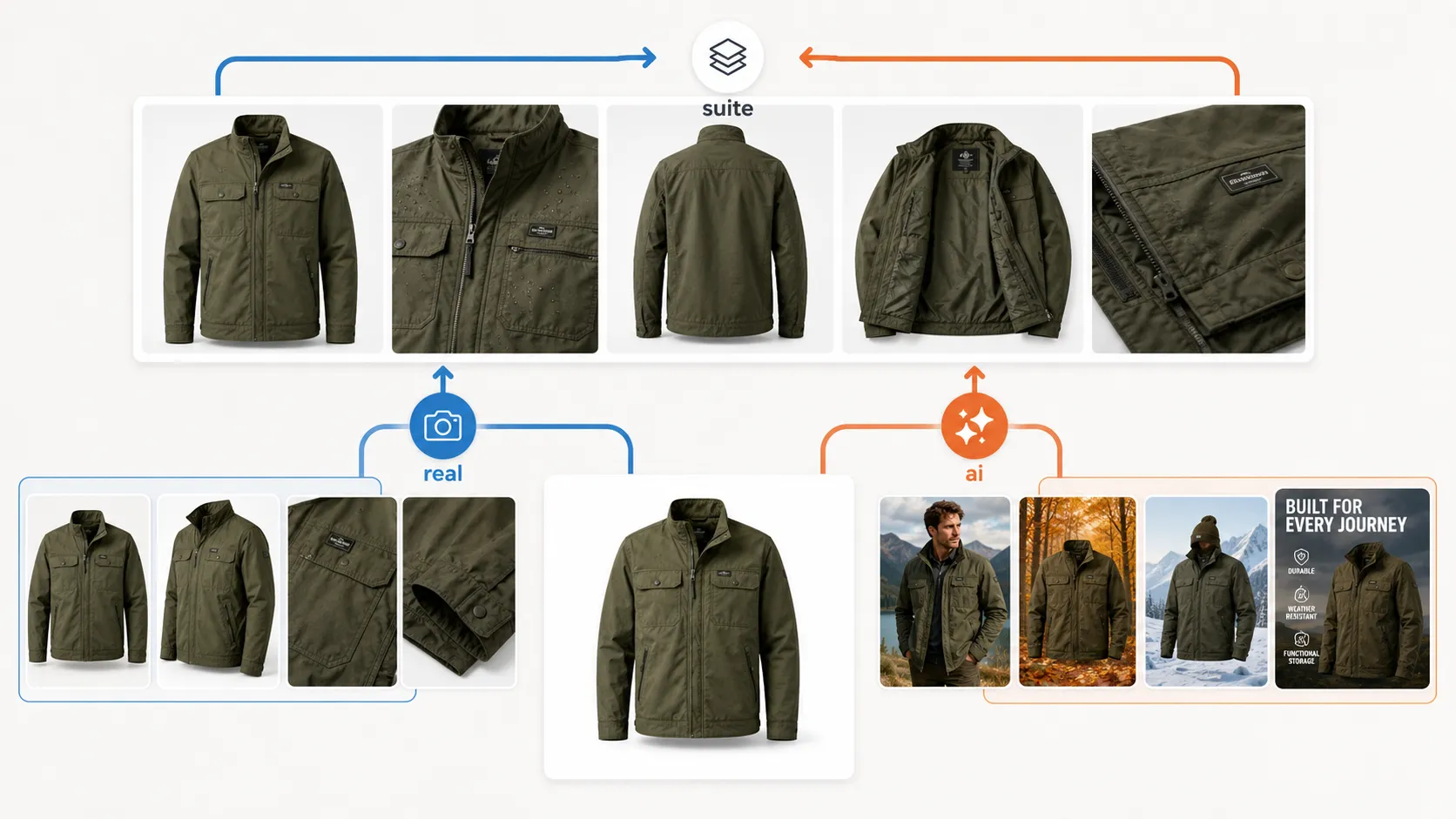
Step 2: Add Supporting References
Add supporting assets only when they clarify something the primary asset does not show.
Useful supporting references include:
- fabric close-up for apparel texture
- label close-up for skincare or packaging clarity
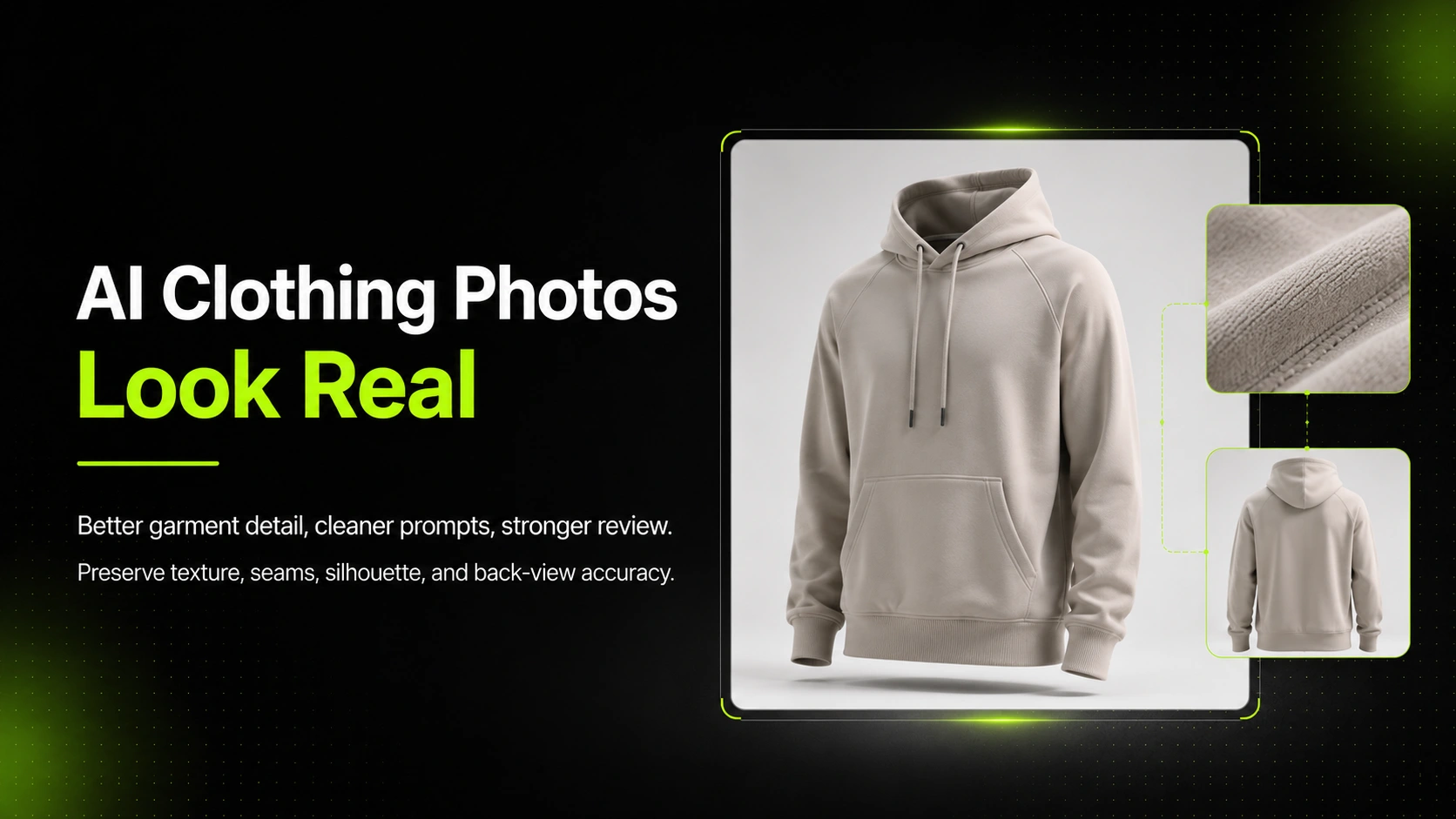
- back-view reference for garments with important rear details
- previous homepage or lookbook image for brand mood
- campaign ad image for seasonal tone
For AI workflows, this helps the model understand both what must stay accurate and what style the hero should follow.
Step 3: Define the Hero Composition
A homepage hero needs a composition plan. Decide where the product sits, where the headline sits, and where the CTA sits before generating variations.
Common layouts include:
- product on right, copy on left
- product centered, short headline above or below
- full-bleed lifestyle image with text overlay on a quiet area
- product group across the bottom with copy above
- split hero with product image on one side and campaign copy on the other
The safer option is usually the layout with the clearest text-safe space. A beautiful image that makes the headline unreadable is not a strong homepage hero.
Step 4: Generate or Design Variations
At this stage, you can use design tools, manual compositing, or AI generation to create hero options.
If your team already has approved product images and needs homepage-ready hero variations, iCreat AI's AI Product Photography workflow can help turn those references into new product-led compositions while keeping review focused on product accuracy, crop, and campaign fit.
Generate or design a small set of variations, not a huge unfocused batch. A useful set might include:
- one product-first hero
- one lifestyle hero
- one collection-routing hero
- one mobile-first crop variation
This gives the team real choices without creating review fatigue.
Step 5: Review Against the Homepage Job
Review each option against the job, not just the aesthetic.
Ask:
- Is the promoted product or collection clear?
- Is the CTA easy to place and read?
- Does the image support the headline?
- Does the crop work on desktop and mobile?
- Does the visual imply anything untrue about the product?
- Is the image strong enough to act as the homepage entry point?
If the answer is no, do not keep polishing the wrong direction. Return to the brief and adjust the source asset, composition, or hero type.
How to Adapt the Hero for Desktop and Mobile
Homepage heroes often fail because the desktop version looks good and the mobile crop breaks the product, headline, or CTA.
Plan two crops from the beginning:
| Version | What to Prioritize | Common Failure |
|---|---|---|
| Desktop hero | wide composition, text-safe area, strong product or scene presence | product too small or copy placed over busy details |
| Mobile hero | vertical focal point, readable CTA, clear product recognition | model/product head or product label gets cropped |
For a linen dress hero, the desktop crop may show the model in a full summer setting with copy on the left. The mobile crop may need a tighter vertical view that keeps the dress silhouette, neckline, and CTA visible.
For a skincare bottle set, the desktop crop may show the full set in a bathroom shelf environment. The mobile crop may need a product-first view so labels stay readable.
Do not assume one image file will handle every breakpoint. Even if the same visual direction works, the crop strategy should be intentional.
Common Mistakes When Reusing Product Assets as Homepage Heroes
Stretching a PDP Image Into a Banner
PDP images are often too tight, centered, or product-only to become a wide homepage hero. Stretching them into a banner can create awkward empty space or make the product feel disconnected from the headline.
Fix: rebuild the composition around the homepage message. Use the PDP image as the product truth source, not necessarily the final layout.
Letting the Background Overpower the Product
AI-generated lifestyle scenes can look polished while making the actual product hard to identify. This is especially risky for fashion and skincare where small details matter.
Fix: keep the product large enough to recognize and review. The scene should support the product, not compete with it.
Forgetting Copy and CTA Space
A hero visual needs to work with headline, subcopy, and CTA. If every part of the image is busy, the page designer has nowhere to place the message.
Fix: specify text-safe space in the brief. Generate or design with the layout in mind.
Creating a Hero That Misrepresents the Offer
A product hero can accidentally imply a bundle, accessory, ingredient, size, or colorway that is not actually included. This can create trust problems before the shopper reaches the PDP.
Fix: review the hero like a merchandiser. If the visual shows three bottles, confirm the offer includes three bottles or make the context clear.
Designing Only for Desktop
A desktop hero can hide mobile problems until late in the workflow. By then, the team may have to crop awkwardly or redesign the visual.
Fix: create desktop and mobile crop plans before final export.
Quality-Control and Consumer Trust Checks
A homepage hero can shape expectations before shoppers read the PDP. That makes product trust a real part of the creative review, especially when AI or heavy compositing is involved.
Check whether the visual could mislead shoppers in any of these ways:
- Product count: a set of three bottles should not look like a bundle if only one bottle is sold
- Scale: a handbag, sneaker, or skincare bottle should not look larger or smaller than the real item
- Material: linen should still read as linen; leather, satin, denim, glass, and metal should not change character
- Color: the hero should not make beige look white, navy look black, or one colorway look like another variant
- Included accessories: props, jewelry, shoes, or extra items should not imply they come with the product
- Use case: a lifestyle scene should not imply waterproofing, outdoor durability, skin benefits, or food-safe use unless the product actually supports it
This is not about slowing down creative production. It is about catching the type of error that looks small in a design review but creates confusion once a shopper lands on the PDP.
Final QA Checklist Before Publishing
Use this checklist before sending a homepage hero live.
Product Accuracy
- Product color matches the source closely enough for commercial use
- Shape, fit, label, logo, material, and proportions are not distorted
- The hero does not imply a bundle, feature, or accessory that is not included
- Variant-specific details are correct
Homepage Fit
- Headline and CTA have enough contrast
- Text-safe space works on desktop and mobile
- The hero routes visitors to the correct page
- The image supports the campaign message, not just the brand mood
Technical and UX Review
- Image file is compressed appropriately for page speed
- Mobile crop keeps the product and CTA readable
- Alt text is descriptive and useful
- The hero does not block navigation or make the page feel cluttered
AI-Specific Review
- No extra product features, straps, labels, ingredients, pockets, or accessories were invented
- Texture and material are believable and consistent with the product
- If the image is used in shopping or feed-related contexts later, the team preserves AI-generation metadata where applicable
- A human has approved product truth before publishing
Google Merchant Center's image guidance is written for product images in ads and listings, not every homepage banner. Still, its core principle is useful: product imagery should accurately represent what is being sold, including the correct variant, product view, and visible details.
FAQ
Turn Existing Assets Into Homepage-Ready Visuals
You do not need a full new shoot for every homepage refresh. Existing product assets can support strong homepage hero visuals when they are treated as source material, not final compositions.
Start with the homepage job, choose the strongest product truth source, build a brief around copy and crop needs, then create variations that preserve product accuracy while supporting the campaign. That process is slower than dragging a PDP image into a banner slot, but it prevents the rework that happens when the hero looks polished and fails the page.
If your team already has approved product images and wants to create homepage hero variations for launches, seasonal campaigns, or collection routing, try iCreat AI's AI Product Photography workflow to turn product references into new ecommerce-ready compositions with review built into the process.