



Why Collection Pages, PDPs, and Paid Ads Need Different Visual Jobs
The easiest mistake is to think that "brand consistency" means showing the same type of image everywhere. In practice, consistency should hold at the brand level, such as color logic, lighting discipline, tone, and product truth. It should not force every surface to use the same crop, same context, or same information density.
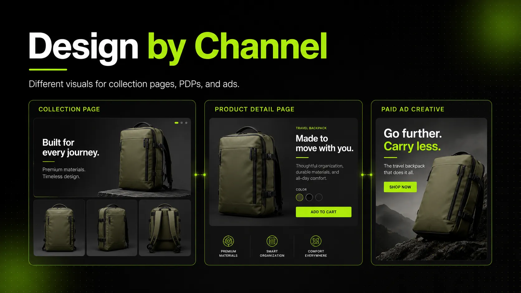
Shopify's collections documentation makes the collection-page role clear: collections group products so shoppers can find and click into the right item. That means the visual job is routing. The image should help people compare, sort, and decide what deserves a closer look.
Shopify's product media guidance points in a different direction for PDPs. Product pages can include multiple images, video, and even 3D models because the user needs more information before buying. That means the visual job is not only to attract attention. It is to reduce uncertainty.
Paid ads are different again. An ad exists before the shopper has committed any time to the product. The image has to stop the scroll, make the product relevant fast, and create enough curiosity or desire for the click to happen.
So the practical rule is simple:
- collection page visuals help the shopper choose where to click
- PDP visuals help the shopper decide whether to buy
- paid ad visuals help the shopper decide whether to care
If a team keeps those roles separate, visual decisions become easier.
What Collection Page Visuals Need To Do
Collection pages are visual merchandising surfaces. They are not mini PDPs, and they are not ad placements.
Nielsen Norman Group's article on product photos on listing pages is useful here because it frames product-list imagery around list behavior: images should help people scan quickly, compare items, and understand what is being offered without extra effort. Baymard's product-list UX research supports the same idea from a different angle. List pages succeed when product cards help the shopper move through a category efficiently.
That creates three practical collection-page rules.
Show the product clearly enough to support comparison
The default grid image should make it easy to compare one product with the next. For a sneaker collection, that may mean a consistent three-quarter or side view that shows silhouette and color blocking. For a linen dress collection, it may mean a stable model crop that makes length, neckline, and sleeve shape legible. For a skincare collection, it may mean a clean front-facing bottle or tube shot that keeps packaging differences obvious.
Keep variation controlled, not random
Collection pages do not need visual sameness at all costs, but they do need rhythm. If one handbag card is cropped tightly, the next is full-length, the third is editorial, and the fourth is product-only, the shopper spends extra attention decoding image style instead of comparing products.
Use the page-level image system to support scanning
The collection hero image, collection banner, and product grid do not need to do the same job. A collection hero can establish mood or season. The grid image should return to product clarity. A hover image can carry a second job, such as back view, alternate angle, or detail cue, without overloading the default card.
For mobile, this matters even more. The smaller the card, the less room there is for ambiguous styling.
What PDP Visuals Need To Do
PDP visuals should answer the questions a collection page cannot answer fast enough.
Salsify's 2026 consumer research is useful here because it reinforces how central images and video remain in product-page decision-making. Baymard's research on product image galleries and resolution and zoom also points to the same behavior: once a shopper is on the product page, they want to inspect details, reduce doubt, and confirm that the product matches expectation.
That means PDP visuals need more informational depth than collection images.
Show enough angles to reduce uncertainty
A collection page may only need one strong front or hero view. A PDP usually needs the front, alternate angle, close detail, and often a back view or fit view. A sneaker PDP may need outsole detail, side profile, and material texture. A dress PDP may need front, back, close-up fabric, and a fit-related model angle. A skincare bottle PDP may need a packaging close-up that keeps label hierarchy readable.
Help the shopper inspect details, not just admire the image
This is where zoom quality, resolution, and detail crops matter. Baymard's zoom research is especially relevant because a visually detailed product becomes harder to trust if the shopper cannot inspect it properly. A PDP image should not only look branded. It should survive scrutiny.
Align supporting media to the buying question
PDP visual sets should not be random galleries. Every media slot should answer a useful question:
- What does it look like from the front?
- What does it look like from another angle?
- What does the texture or material actually look like?
- How does it fit on body or in use?
- What packaging or branding details matter before purchase?
That is a different job from a collection page, which mainly needs to get the right click.
What Paid Ad Visuals Need To Do
Paid ad visuals live in a much harsher environment than either collection pages or PDPs. They compete against everything else in the feed, not just other products from the same brand.
So the visual job changes again.
Stop the scroll fast
An ad image needs clear visual hierarchy, strong product relevance, and fast legibility. A handbag ad may need more environment or motion cue than the product-page hero. A sneaker ad may need stronger scene energy than the category grid image. A skincare ad may need a cleaner value communication cue than the PDP close-up.
Make the product relevant before the user knows the product
On a PDP, the shopper is already evaluating. In a paid ad, they are not. The image has to carry more of the first impression. That is why context, hook, and format matter more.
Respect channel constraints
Paid ads are also the most format-sensitive surface. Because Meta official pages were not fully accessible in this environment, it is safer to avoid over-specific placement claims here. But the general rule still stands: paid placements vary by aspect ratio, safe area, and overlay behavior, so ad visuals should be planned for the target placement instead of recycled from PDP assets at the last minute.
For feed-driven paid-shopping contexts, Google Merchant Center's `image_link` documentation is more concrete. It states that shopping listings use the main product image, and Google notes a minimum image size change taking effect on January 31, 2027, with 1500 x 1500 recommended for best performance. That matters because a shopping image is closer to a product-first ad unit than a styled paid-social creative.
So not all paid ads need the same image style either:
- product-first paid-shopping images need clarity and compliance
- paid-social images need scroll-stopping composition and faster emotional framing
- retargeting images often need freshness more than reinvention
Collection Pages vs PDPs vs Paid Ads
| Surface | Main User Task | Best Default Visual Behavior | What the Image Must Answer | Main Risk |
|---|---|---|---|---|
| Collection page | scan and compare | consistent, category-friendly, easy to decode | what is this product and should I click it? | over-styled or inconsistent grids that slow comparison |
| PDP | inspect and evaluate | richer image set with multiple useful views | what exactly am I buying and can I trust it? | shallow galleries that leave unanswered questions |
| Paid ads | notice and click | hook-driven, placement-aware, fast to understand | why should I care enough to click now? | using flat product-page logic in a competitive feed |
This table is the core decision frame. Once teams stop asking one image set to do all three jobs, visual planning becomes more strategic and less reactive.
Which Image Types Belong On Which Surface
The next decision is not only page type. It is image role.
| Image Type | Collection Page | PDP | Paid Ads | Best Use |
|---|---|---|---|---|
| clean product hero | Yes | Yes | Sometimes | strongest when clarity matters most |
| model image | Yes, when category comparison stays clear | Yes | Yes | useful for apparel fit and aspirational context |
| detail close-up | Hover or secondary only | Yes | Rarely | best for texture, labels, hardware, and proof |
| lifestyle / editorial image | Hero or banner, not default grid for every SKU | Supporting only | Yes | strongest when mood or use case matters |
| back view / alternate angle | Hover or secondary card view | Yes | Sometimes | useful when silhouette or structure affects buying |
| packaging-focused image | Limited | Yes | Sometimes | strongest for skincare, beauty, and boxed products |
This is where concrete product examples help.
For a sneaker:
- collection page default: a clear side or three-quarter view that supports color and silhouette comparison
- PDP: side, top, outsole, close texture, and fit or on-foot angle
- paid ad: a stronger contextual image that emphasizes motion, use case, or style contrast
For a skincare bottle:
- collection page default: front label view that separates SKUs quickly
- PDP: front label, side/back label if useful, texture or dispense cue, packaging scale
- paid ad: simplified hook image that keeps the bottle recognizable without relying on tiny copy
For a linen dress:
- collection page default: consistent model or product crop that shows silhouette and length
- PDP: front, back, fit, fabric texture, neckline, and movement or drape support
- paid ad: stronger scene or styling context that makes the product feel relevant fast
How To Build One Source Set Into Three Asset Systems
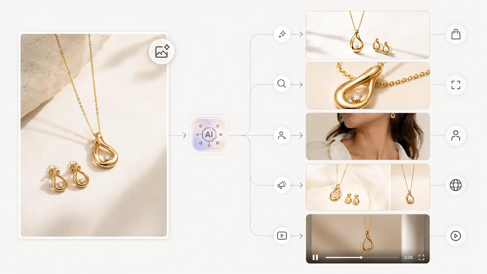
The most practical workflow is not to shoot or generate three unrelated sets from zero. It is to start from one approved source set, then branch the outputs based on surface role.
Step 1: Define the source set
Start with the product assets that should remain true everywhere:
- one approved hero or front view
- one alternate or back view if relevant
- one detail or material close-up if the product needs it
- brand cues such as background discipline, color handling, and styling limits
For a handbag, that source set should preserve silhouette, hardware tone, and material finish. For a dress, it should preserve cut, hemline, neckline, and fabric behavior. For a skincare bottle, it should preserve label hierarchy, cap shape, and product color.
Step 2: Build the collection-page set
Create the assets that support browsing first:
- default card image
- hover or alternate view if the store uses it
- collection hero or banner if needed
This is where AI Product Photography can be useful. The workflow is not about creating random beauty shots. It is about generating a controlled set of product visuals from approved references, in the aspect ratios and crops that make category browsing easier.
Step 3: Expand into the PDP set
Now create the deeper product-page assets:
- clearer alternate angle
- close detail or material crop
- fit or use-case image
- white-background or product-isolation variant if helpful
This is where AI Fashion Detail Image Generator fits naturally. The value is not just "more images." It is more useful images for product evaluation.
Step 4: Adapt into the paid-ad set
Once the browse and evaluation systems are stable, create paid-ad variants that change the hook without changing the product truth:
- stronger context or mood
- platform-specific crops
- seasonal background or scene shifts
- retargeting refreshes of a proven visual concept
This is where AI Image Replacer or AI Fashion Lookbook Generator can help. A team can reuse one strong product concept, then adapt it for collection storytelling or campaign hooks without forcing the collection page and PDP to inherit the same ad-style treatment.
Step 5: Review surface by surface
Do not review only for image quality. Review for role fit:
- does the collection image help comparison?
- does the PDP image answer a buying question?
- does the ad image create enough relevance to deserve the click?
That is the step most teams skip.
Common Mistakes When Teams Reuse the Same Visual Everywhere
Most weak ecommerce image systems come from one of four mistakes.
Mistake 1: using editorial or lifestyle images as default collection thumbnails
These images may look premium, but they can make the grid harder to scan. If the shopper has to work to identify which dress, sneaker, or handbag is on each card, the collection page stops functioning like a browsing tool.
Fix: keep the collection default image easier to compare, and move the mood-heavy image into the hero, banner, or hover role.
Mistake 2: treating the PDP like a prettier collection card
Some PDPs repeat only hero-style images with no real inspection support. That forces the shopper to decide without enough detail.
Fix: build the PDP around uncertainty reduction. Add angle, detail, fit, packaging, or texture support where it changes the buying decision.
Mistake 3: recycling PDP images into paid ads without changing the visual job
A clean PDP image can be accurate and still underperform in paid media because it does not create enough contrast or urgency in the feed.
Fix: adapt the visual logic for the ad. Keep the product truthful, but change the hook, crop, or context to match the interruption-first environment.
Mistake 4: forcing consistency beyond the point where it helps
Teams sometimes over-correct by making every image identical. But collection pages, PDPs, and paid ads should not be identical. They should feel related while answering different questions.
Fix: keep consistency at the system level, such as color discipline, lighting logic, and brand tone. Let crop, context, and information depth change by surface.
Why Surface Mismatch Breaks Consumer Trust
Trust breaks when the shopper feels that the brand is showing a different version of the product depending on where they see it.
If the collection page shows a cool-toned dress, the PDP shows a warmer and more fitted-looking version, and the ad shows a highly styled scene where the dress reads like a different product entirely, the shopper absorbs that mismatch even if they cannot describe it precisely.
That matters because image systems are not only aesthetic systems. They are expectation-setting systems.
For a skincare bottle, trust breaks when the ad emphasizes a glossy, oversized package look but the PDP does not confirm label clarity or actual packaging details. For a sneaker, trust breaks when the ad suggests a shape or material finish that the product page does not support. For a handbag, trust breaks when metal hardware, leather texture, or scale cues shift between surfaces.
The cost of getting this wrong is not only lower conversion. It is more hesitation, more internal revision, and more mismatch between the promise of the click and the reality of the product page.
What To Review Before Publishing Across Collection Pages, PDPs, and Ads
Before publication, review the asset system as one connected set.
- Product shape: does the silhouette stay believable across collection cards, PDP angles, and ad variants?
- Color accuracy: does the product look like the same SKU on every surface?
- Logo placement: are visible brand marks consistent and correct?
- Material or texture consistency: do mesh, leather, linen, gloss, or knit surfaces stay believable across outputs?
- Cropping and aspect ratio by surface: is each crop appropriate for the job it needs to do?
- Target channel requirements: does the shopping image meet platform rules, and do paid placements use compatible formats?
- Customer interpretation: could the styling or context make the shopper expect a different product than the one being sold?
For collection pages, pay extra attention to scan speed. For PDPs, pay extra attention to detail support. For paid ads, pay extra attention to clarity under feed conditions.
FAQ
Conclusion
The best way to design product visuals for collection pages, PDPs, and paid ads separately is to stop thinking in terms of one image library and start thinking in terms of three visual jobs. Collection pages route attention. PDPs reduce uncertainty. Paid ads win the click.
Once that framework is clear, the workflow becomes more practical. Build one approved source set, then generate separate asset systems for browsing, product evaluation, and paid acquisition. If your team needs to scale that process without making every surface reuse the same image logic, a product-focused workflow such as AI Product Photography can help you branch the right visuals from one approved base instead of rebuilding every channel by hand.